It is the era of Video Streaming Apps like Netflix. But, what role do UX Design Principles play in developing such apps?
Let’s find out.
Suppose you want to continue watching Money Heist that you started a week ago at 3 in the morning. You open Netflix, see the home page, select your profile, and look for the “Continue Watching” section to watch Money Heist right from the scene where you left. You enjoy watching it till 5 in the morning and fall asleep.
That’s an example of a good UX. There is minimal friction and the information here is easy to find.
Now here’s another example – you feel like watching a show, open any random video streaming app, spend time searching for the show and then land on the episode page. You look for where you left the story, feel tired, and sleep.
That’s a disaster. And modern-day users don’t tolerate that.
To make your application love-worthy for your users, it is essential to keep them hooked by providing them all they want. Remember, humans have an attention span of just 8 seconds as that of a goldfish.
Let’s unravel how you can manage to make that instant connection using the underlying UX design principles examples:
We respect your privacy. Your information is safe.
What Keeps Us Hooked to These Services?
Content, of course, is the main reason why we buy access to these services in the first place, but what happens once we have access to all that content?
It gets overwhelming to search through hundreds of thousands of TV shows and movies without knowing which ones match your taste. According to a study, around 77% of users face a hard time in just choosing content they should watch.
As a solution, some people even search for listicles online to get recommendations for what they should watch next.
In the end, they end up wasting their time in searches and then more searches. To solve the underlying problem, all you should do is provide intuitive, personalized experiences to each one of your users following the best UI/UX Design Principles.
A lot of streaming apps have already eliminated friction between users discovering and watching content online. With a number of techniques to help you discover your kind of content, and effective User Experience Design that enables you to take the right actions — these services make it easier to stay hooked and keep you binge-ing.
Now let’s see some of the most important UX Design Principles with examples for Video Streaming Apps.
1. Seamless App Onboarding Process
Obviously, when users come to a video streaming app, they come with a will to enjoy its content. Not to fill long sign-up forms. So, one of the first UX Design Principles while making an app like Netflix is to provide users a painless onboarding experience.
If we talk about Netflix – its onboarding process runs as smoothly as possible.
When thinking, it is possible to imagine a video streaming app’s onboarding experience as a total disaster considering the massive number of shows and movies available on the platform.
However, Netflix is sorted, which is why it is considered one of the best video streaming apps of the decade.
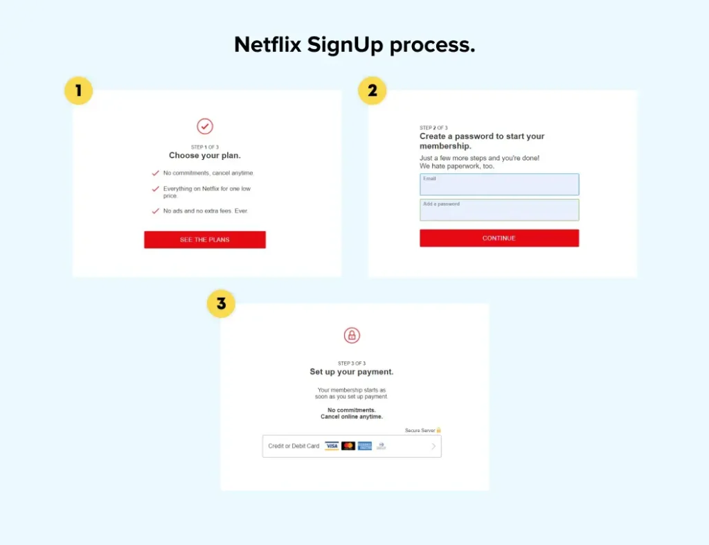
On the first page, the app provides users a text in big fonts, which sums up the USP of the app and tells its users that it is a paid service – “Watch anywhere. Cancel anytime.”
And once users decide to use the service, they can come on board by following just three simple steps:
2. Personalization: One of the most Important UX Design Principles
It is probably the most famous UX Principle used by businesses to connect with their customers. It just works.
The content offered by recommendation engines in apps like Netflix is far more likely to be consumed, compared to content that is listed randomly. Your YouTube homepage is the first and biggest example of this.
Let’s see how the likes of Netflix implement UX personalization using examples:
Netflix’s ‘Who’s Watching’ Page
Personalization on Netflix starts from the get-go. Can you recall the first screen you see when you log into Netflix?
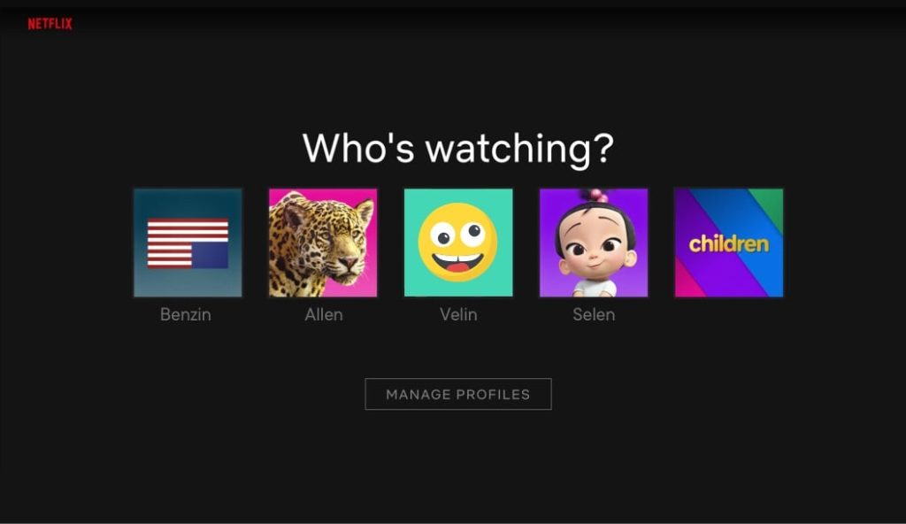
Netflix lets you set up separate profiles for different people who use a single account — keeping content recommendations separate and personal for each profile.
Even though you might use the same account, your profile will always reflect your taste.
Everything you see after clicking on your thumbnail belongs to you.
Previews and Thumbnails
For providing personalization, Netflix doesn’t just stop at the start screen.
It takes User Experience to another level by personalizing every element in the app. The service also offers personalization in artworks and video thumbnails.
They use a framework called contextual bandits to deliver the most appealing video thumbnail that can lead users to take an action.
A person who is more interested in romance, and a person who is more interested in comedy may see the same movie title but the thumbnails will highlight romance and comedy differently for each of them.
So users might be seeing different previews for the same movie or TV show.
Netflix Percent Match Score
Remember seeing Netflix match score next to the videos on your home screen? It’s called a Percent Match Score, which adds more personalization to the Netflix UX.
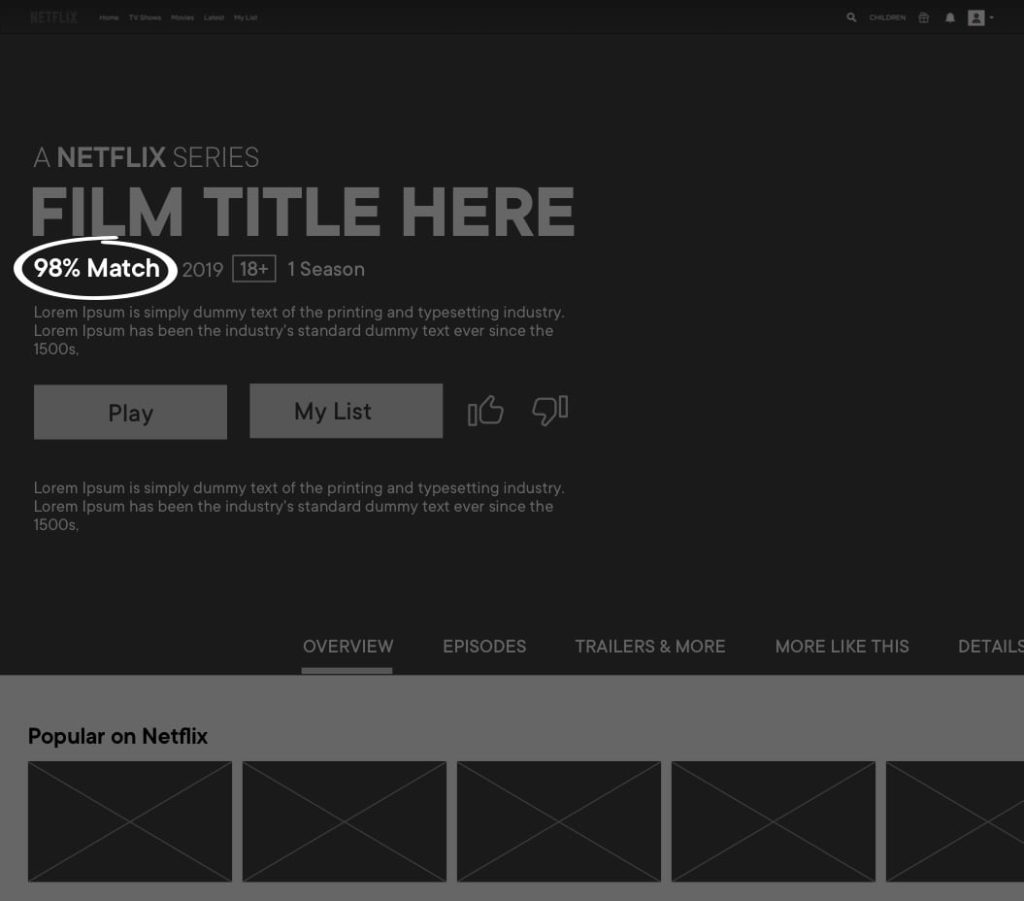
To show how much a movie or TV show matches your taste, Netflix uses Percent Match Score. Higher the percentage, better the match — which makes it easier for a user to decide what to watch. Netflix uses this feature to help users make decisions faster.
3. Decreased Cognitive Load Means Improved UX
Imagine having to search for a show instead of stumbling upon one. How would you like that?
You’ll notice how no video streaming app has a big search bar on their home page. Instead, the page starts straight with a video, followed by a list of your favorite or previously watched shows.
All of this is done to decrease cognitive load on a user and that comes in the list of UX best practices for streaming services.
When you see shows that you previously watched, you’re more likely to watch them again.
According to user researchers, this is also known as the Default Effect — where a user doesn’t have to think too much about choosing what action to take, and simply goes with the suggested or default action presented to them.
Here is how Netflix do that:
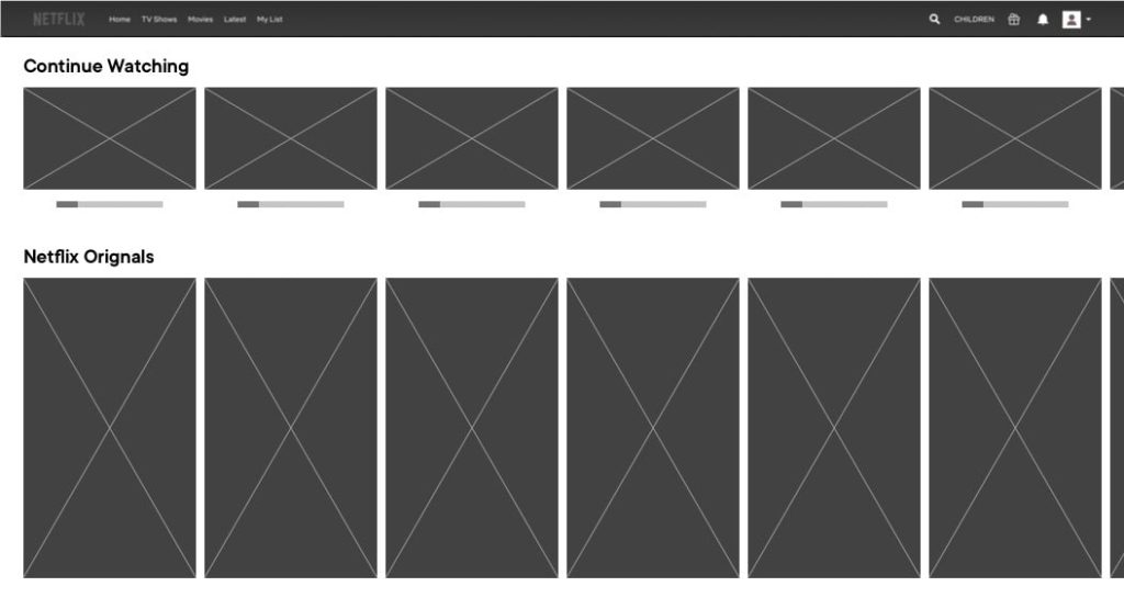
If you don’t want to decide what to watch, you’re more likely to go with what you’ve already been watching.
4. Too Much Information Harms Everyone
What kind of information do you find on a standard video streaming app’s home page?
For Netflix it’s a non-intrusive navigation bar that includes the Netflix Logo, nav items, and a search bar on top of a big video preview of a featured movie or TV show.
Pay close attention to the first section. Netflix designs displays minimal information over the video –
– A video title: small in size, non-intrusive.
– ‘Play’ and ‘More Info’ buttons: actions that Netflix wants you to take.
– Audio on/off button: allowing you to view a video with/without audio support.
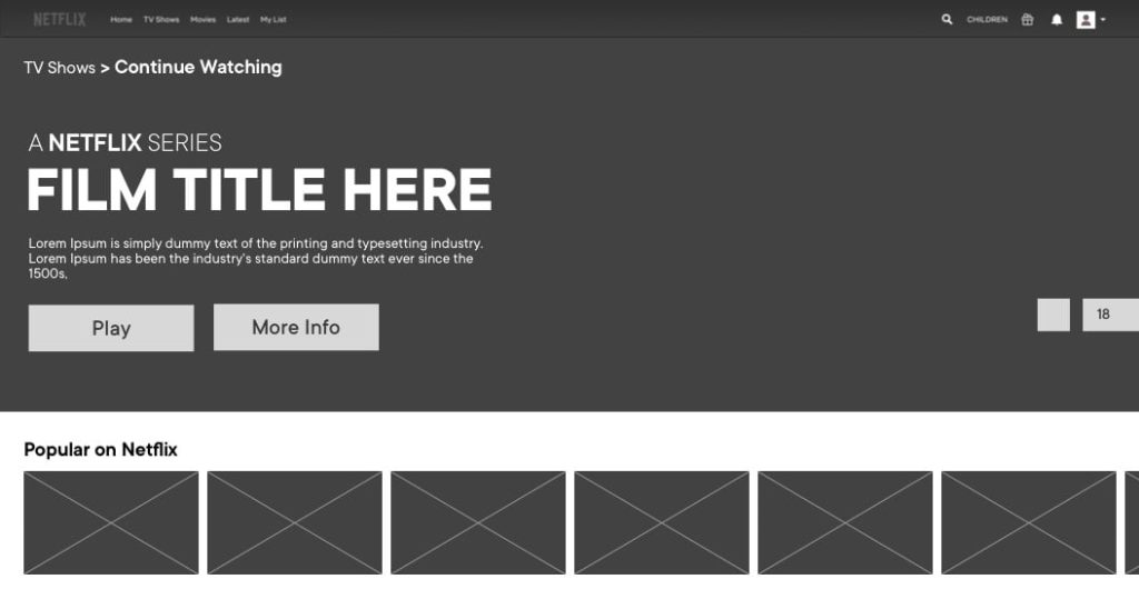
And that’s something that makes the Netflix UX not just non-irritating but attractive. They only provide information that doesn’t make a user think too much and puts focus on the video being played.
5. UX Should Be Seamless Across Devices
Regardless of whether a user is accessing your services on a mobile app, desktop, or mobile website, the transition between them should be seamless and consistent. All the design elements should mirror each other and that’s one of the important UX Design Principles (for example, you shouldn’t use red for the desktop and green for the mobile).
With the proliferation of new devices in the market and the rise of mobility, users expect brands to deliver an accessible, efficient, and movable experience as they change devices.
As a result, it is no longer enough for brands to provide solutions for various channels; they must blur the lines between multiple devices’ experiences.
For example, if a user is traveling and wants to continue watching the show on his mobile that he was watching on his desktop last night, he should be able to move seamlessly without difficulty.
A consistent experience doesn’t just make things simpler for users, it also creates brand awareness.
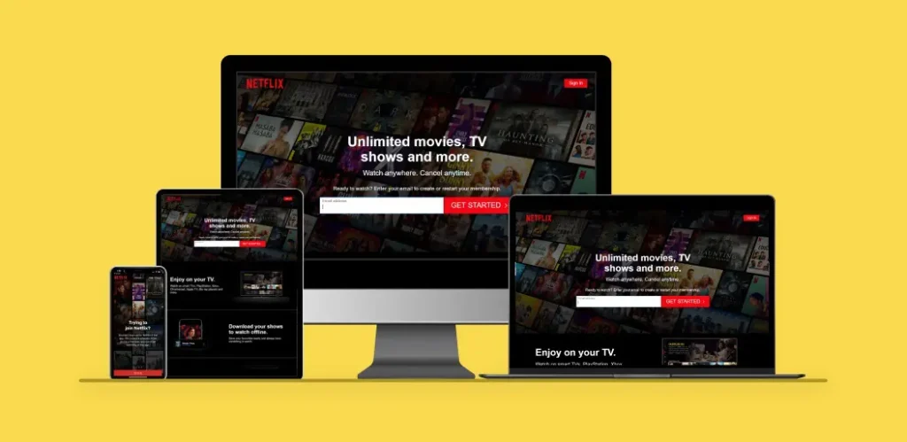
So the above-mentioned are the UX Design Principles that you need to keep in mind while developing an app like Netflix. Now let’s take a look at one of the most widely discussed topics of the digital era.
Netflix vs Prime Video: Who Follows the Best UX Design Principles?
To find out which service out of Netflix and Prime Video wins the game – let’s compare the two using core UX attributes:
- Appeal
- User Interface (UI) Controls
- Usability
Netflix vs Prime: Appeal
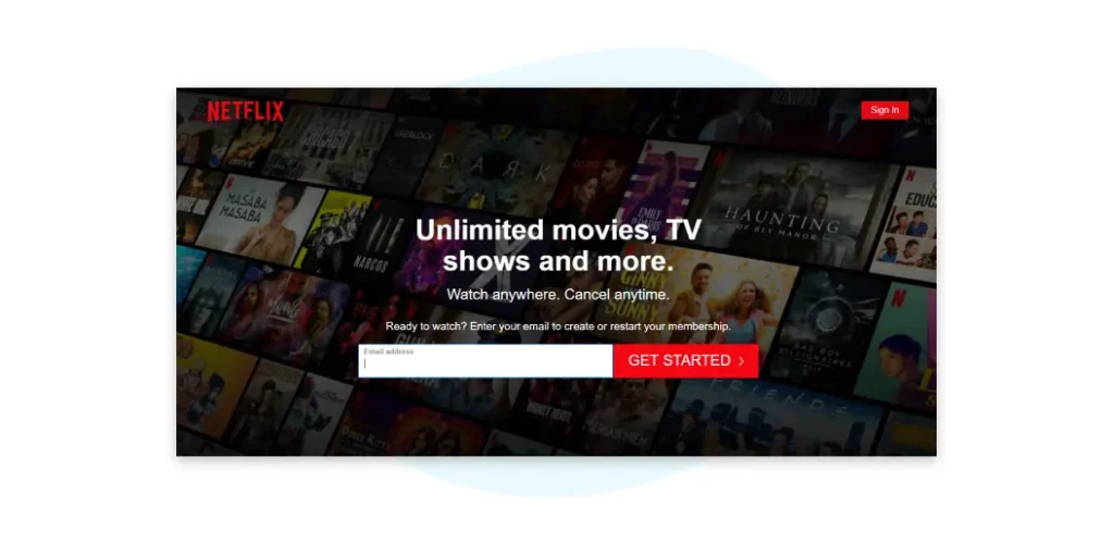
When you land on the homepage of Netflix, this is what you see:
And this when landing on Prime Videos:
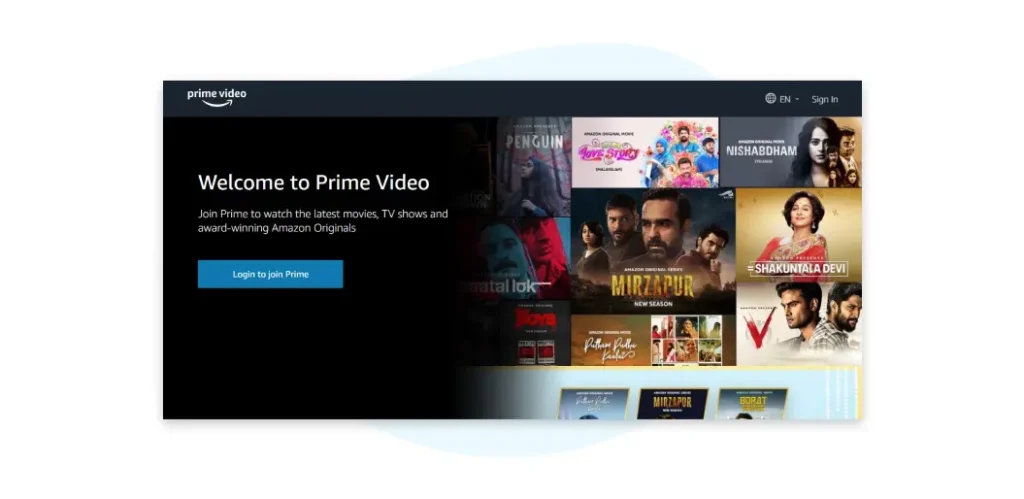
Netflix provides you a dark theme using many vibrant colors that align well with its overall UX.
Similarly, Prime has a blue tone, which looks smooth and nice. But, if we dig deeper and see what these video streaming giants have in-place for users on their home screen – we will realize the difference.
On desktop as well as mobile app, Netflix starts with a big ad for originals, but right below that section, you will see content that you are already watching so that you can pick up right where you left.
This provides users with a personalized and consistent experience across devices. Also, it just takes one click to switch devices while streaming on Netflix.
However, this is not true when it comes to Prime. It shows the “Continue Watching” section on mobile but not on desktop, making Prime’s UX less pleasing than that of Netflix.
Netflix vs Prime Video: UI Controls
UI controls are the main pillars of any software interface that can impact the overall user experience. Using them intelligently, you can guide users through the entire app even if they are using it for the first time.
Let’s talk about these controls in Prime vs Netflix UI:
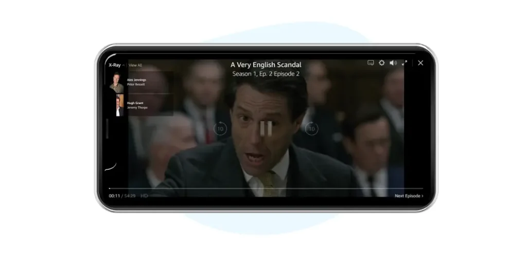
Prime Video has spread out UI controls on the corners and in the middle of the screen:
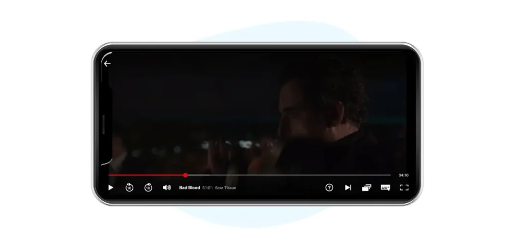
While Netflix shows all UI controls at the bottom of the screen:
Here Prime is the clear winner as it prioritizes most used controls (Play/Pause, forward, and backward) by placing them at the center of the screen and keeping the rest of the controls aside.
Whereas Netflix shows all UI controls at the bottom and that too in a very small size, it is hard for users to find their functions.
Netflix vs Prime: Usability
Usability is defined as a measure of how well a particular user can achieve a specific goal in an app satisfactorily, effectively, and efficiently.
A few things that will help you find better insights on the usability of an app are:
- Can people land on your product/service page and get started?
- Do they know at a glance where they are?
- Can they accomplish their core goals in-app easily?
Now let’s measure the same for Netflix and Prime using an example:
Suppose you want to watch Suits. Here is how your search will vary for the same keyword on Netflix and Prime:
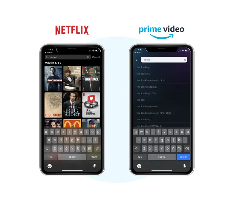
While Netflix provides you a reactive, fast, and dynamic search, Prime confuses you by providing too many options for a simple term. And users will have to make one extra click to accomplish the task they are eager to perform, which makes its UX less smooth than Netflix.
So, that was all about Netflix vs Prime Video. All in all, we can say that both these premium video streaming services are good competition for each other. While Prime offers users better controls, Netflix’s content and personalization is unmatched. And in terms of offering user experience, both are doing a great job!
That’s why we would suggest if you plan to launch a video streaming app in the market, don’t look for who’s best. Make a list of best UX Design Principles followed by these apps and create a platform that has the best of both worlds, with a tinge of creativity to disrupt the market. That is going to be a win-win for you.
Conclusion
There’s no singular path to a great user experience design. Companies like Netflix and Prime understand this, and keep continually improving their design based on data.
And the truth is that the market for Streaming Software is still developing, and there’s a lot of potential for new, innovative startups that can carve out a niche. That’s probably one of the biggest shortcomings of big players like Netflix – they are unable to cater to specific demands for video streaming – which gives an advantage to start ups.

