From the way we talk to the way we shop – everything is moving online slowly but surely. In the last few decades, eCommerce has turned from being non-existent to a multi-billion dollar industry, and there is no sign of its growth slowing down.
But, everyone who uses online shopping websites does so a little differently due to many factors – it could be age, internet speed, or any disability. According to the World Health Organization, 7.5% of the world’s population has some kind of disability.
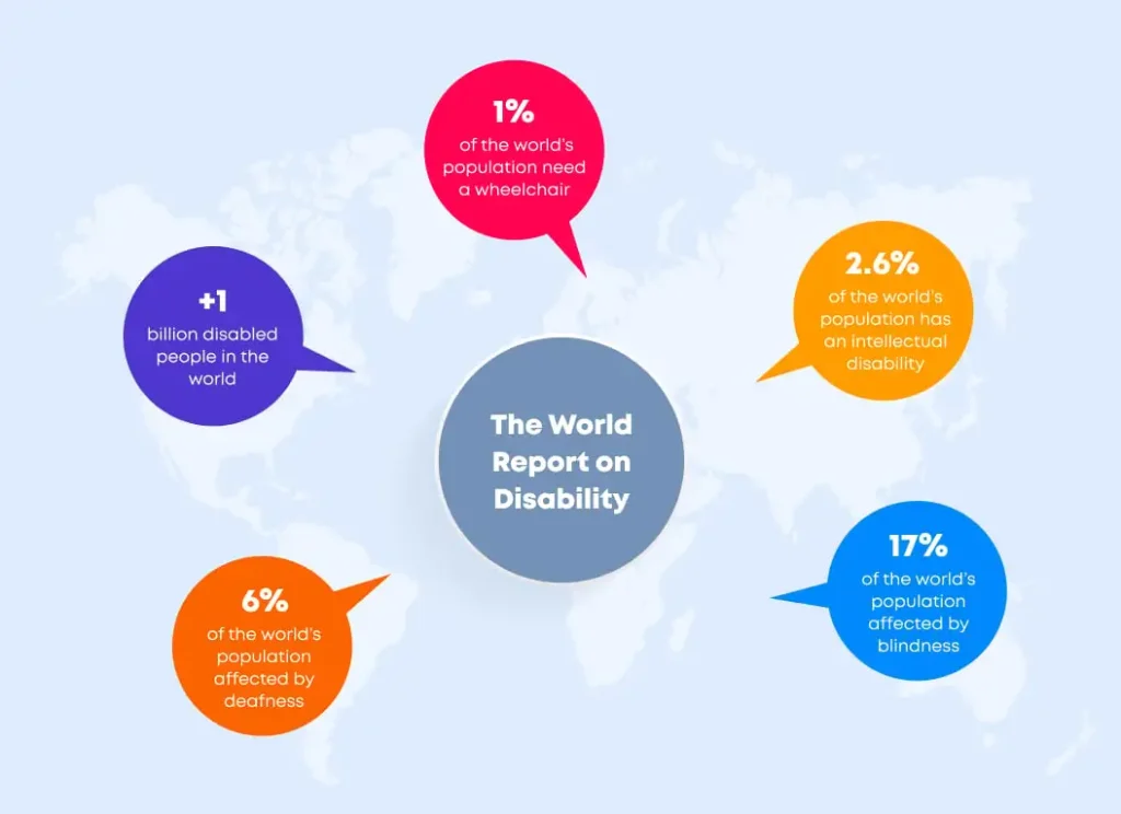
However, people with disabilities spend around £24.8 billion in the UK alone yearly (around 10%
of the total online spend), which is a number significant enough for eCommerce
businesses not to ignore. A survey by Click-Away Pound says that UK businesses are
missing out on over £17 billion annually by not providing accessible websites.
As per the same survey, the top three challenges faced by disabled people while accessing
websites include:
- Crowded pages with too much content
- Captcha needs
- The poor link information and navigation
These compelling spending figures create the need to design and maintain a store that is accessible for everyone. The goal of accessibility in eCommerce is developing an online store that everyone can use no matter what their disability is – hearing loss, vision loss, or any cognitive issue.
This blog will shed light on how online businesses can target this hidden market by improving
eCommerce web accessibility. So, let’s start with the basics.
What does Web Accessibility mean?
In simple words, web accessibility means that a website is accessible by everyone irrespective of
their disabilities. It says that people with disabilities should understand, navigate, perceive,
and interact with a website or use it without any friction.
For eCommerce businesses, it is essential to pay special attention to web accessibility. It isn’t
just a right economic decision, but there are strict laws worldwide in favor of web
accessibility.
For example, ADA (American Disability Act) states that no individual shall be discriminated
against based on disability. Thus, it becomes essential for eCommerce business owners to develop
websites adhering to ADA guidelines to avoid potential litigation.
In recent years, several lawsuits were filed against big eCommerce businesses like Nike,
Domino’s, and many others for not adhering to ADA guidelines. The majority of these cases are
about websites being inaccessible for people with blindness or hearing difficulties. Therefore,
you must invest in designing and developing eCommerce
websites as per World Wide Web Consortium’s guidelines.
“The power of the Web is in its universality. Access by everyone regardless of
disability is an essential aspect “
The W3C web accessibility initiative, along with government, disability organizations, and
research centers worldwide, develop rules and guidelines to help make the web accessible to
people with cognitive, physical, neurological, auditory, visual, and speech disabilities.
Let’s have a look at four principles of web accessibility defined by the W3C.
What are the 4 Principles of Web
Accessibility?
For web
developers, W3C has developed Web Content Accessibility Guidelines (WCAG) that define a
set of rules to make web content accessible to everyone, including people with disabilities and
older people with changing physical abilities due to aging.
It is important to note here that WCAG is a set of standards or web accessibility guidelines and
not laws. The worldwide web consortium evaluates websites based on these standards but doesn’t
have the right to enforce them on anyone.
However, to avoid any legal risks and to maximize website performance and sales, it is good to
use these guidelines as a foundation for developing eCommerce websites.
The W3C divides web accessibility into four principles defined below:
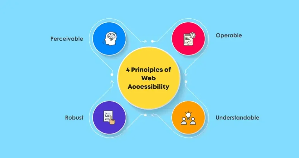
- Perceivable
As the name defines, the first principle of web accessibility says that every website user must be able to process or perceive the given web content – no matter how.
Among other things, this means providing audio for those who can’t see and text for those who can’t hear. Every website’s content must be perceivable by screen readers and other assistive technologies. If your eCommerce website design requires hearing or sight, it won’t pass the test.
Therefore, before launching an eCommerce website, it is crucial to check whether it is having some content that a blind, deaf, or low vision person can’t process. If yes, consider looking for options like providing “alt tag” for images and captions for multimedia content.
- Operable
It says people with disabilities should be able to use and operate websites without much difficulty. For example, several users with disabilities cannot use a mouse, so you must implement keyboard-based functionalities.
Also, elements of a website like media or animations should be controllable for users. People with cognitive issues find it hard to understand the information fast. That’s why websites should give them enough time to read and understand the content.
Giving users the ability to pause through the slides is the right way of ensuring that users have control. Other specific techniques that can help a website clear the operability test include well-organized content, clear page titles, and comfortable website architecture.
- Understandable
Along with making websites perceivable and operable, W3C says that website content and functionality should also be easily understandable. It means users should understand every element of a website either by themselves or with the help of assistive technologies like screen readers.
Understable eCommerce websites use clear and concise language and have navigation and functionality that is easy to use and understand. Therefore, when you develop an eCommerce website, make sure its text is readable, understandable, and it operates predictably. For example, forms should provide clear labels, and the navigation of websites should be consistent and constant.
- Robust
It says accessible websites have maximized compatibility with the user’s choice of tools. A website should perform well across different browsers, platforms, and devices and not dictate the web accessibility tools users use.
Websites must have responsive designs and cross-platform compatibility not to face any problem while switching browsers or devices. Your website can only pass the robustness test if you follow software development best practices and meet all the necessary development standards.
While the above-mentioned are generic principles defined by W3C, let’s now find particular elements that can help make websites ADA compliant and per the guidelines from W3C.
7 Elements of an Accessible ADA-Compliant Website
While there are no enforceable ADA laws to follow for website accessibility (except for local, state, and federal government websites), it doesn’t mean that your website can’t be presented with a lawsuit for not being accessible.
In many countries, non-government websites are referred to as “public sector” entities, which allows the legal system to focus on cases filed by people with disabilities who can’t use a public-facing website efficiently.
All countries have different laws and regulations regarding web accessibility, so you need to understand your own country’s recommendations to avoid any legal complications in the future.
Based on W3C guidelines, here are seven elements to take care of when developing accessible websites:
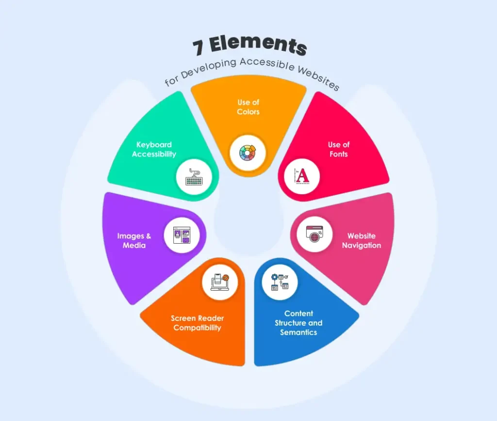
Web accessibility might sound costly or even complex to you, but it is not so in reality. From
the design perspective, even small modifications can make a huge difference. And, the benefits
that it will provide to your eCommerce platform are unparalleled in the long run.
3 Benefits of Accessible eCommerce
Websites
You might have a question in mind: why do we need web accessibility at all? Well, here are some
of the fantastic benefits you get when you develop an accessible eCommerce website:
- Creates Delight & Customer
LoyaltyImagine how a disabled person would feel when he can navigate smoothly through your
website without any human assistance? Top of the World, Indeed! That’s the power of an
eCommerce store that is accessibility inclusive.Such inclusion makes them feel confident about themselves and gives them a reason to
stick to your brand.Moreover, eCommerce businesses looking forward to creating User Experience should design a website supporting
equity (giving everyone what they need) over equality (treating everyone the same).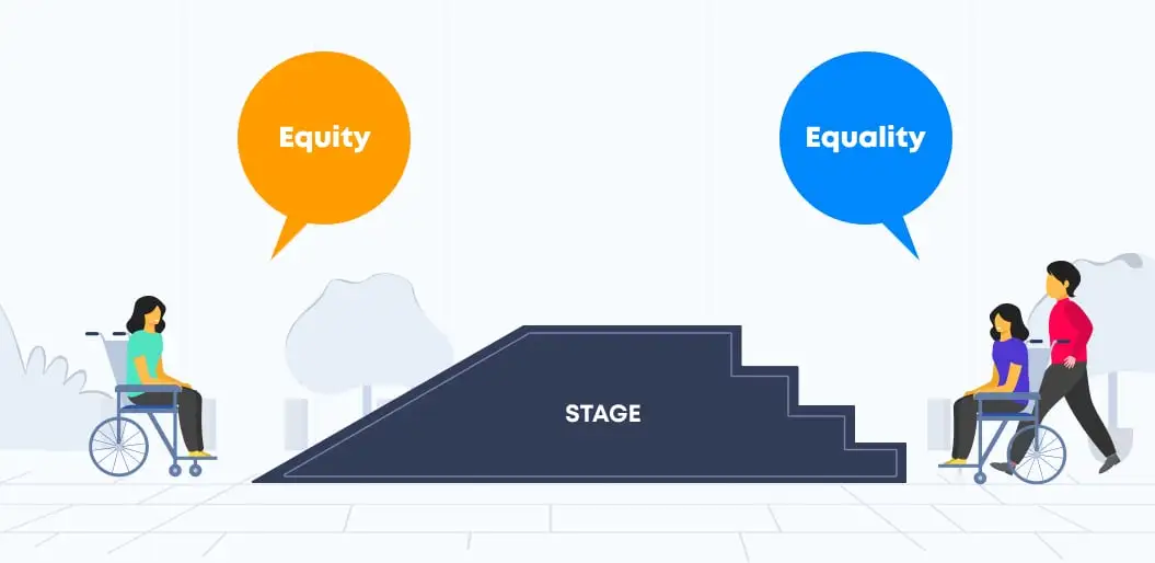
- Adherence to the Web Accessibility
LawsWebsite accessibility in eCommerce is a topic that has gained momentum recently owing to
the possibilities introduced by the latest advancements in technology. The awareness
around the issue has also led to certain critical amendments in the original “Americans with Disabilities Act of 1990”. Such is
the significance of web accessibility standards!The law, in general, prohibits any form of discrimination against the disabled. According
to Title III of the act, websites are considered “places of public accommodation.”Where, Public Accommodation = All businesses open to the public (Offline & Online).
Thus eCommerce managers are mandated by law to make their businesses accessible for the
disabled. - More Traffic = More
ConversionsAccording to the Disability Inclusion Overview, around one billion people, i.e.,
15% of the world’s population, experience some form of disability.Now, that is precisely the number that you are losing out on when generating sales from
your “non-accessible” eCommerce
solution.The secret to the success of your eCommerce storefront lies in the hands of everyone,
irrespective of them being disabled. So, if you approach the 15% mentioned above, you’ll
be making a lot of difference.The math is simple: More traffic = More conversions! After all, you need to be the change
that you wish to see in the world!Now that you know the excellent benefits of adding accessibility to your eCommerce store,
let’s see how you can implement best practices for website accessibility to avail these
amazing benefits.
6 Tips for Implementing Web
Accessibility in eCommerce
In 2019, the US supreme court decided in favor of Guillermo Robles, a blind person who
couldn’t order pizza from Domino’s web and mobile app even after using screen-reading software.
In the last year, many such cases put eCommerce businesses on strict notice: now is the time to
make your e-stores accessible.
While these lawsuits are just one reason, an accessible eCommerce site provides other benefits as
well—for example, enhanced customer experience, better SEO, improved brand reputation, and more
sales.
Here are six tips to make your website accessible for everyone out there with or without
disabilities:
- Use the Right Colors
Color is a vital visual element that a business can use to drive actions and create a
strong brand image.However, color blindness affects around 8% of men and 0.5% of women in the entire world.
Therefore, websites should use colors carefully and never as the only means for
conveying important information.Here are some best practices for using colors to improve eCommerce web accessibility:
Avoid Low Contrast Colors
The primary issue color blind people face is difficulty in seeing colors having less
contrast. That means what you may see as a subtle text effect could be impossible for
some of your website visitors to see, not only if they are color blind but also if they
have low vision.Therefore, make sure you take the color wheel’s help and contrast using complementary
colors only — at the opposite end of the wheel. It provides high impact and high
contrast color combinations that appear brighter and help you improve web color
accessibility.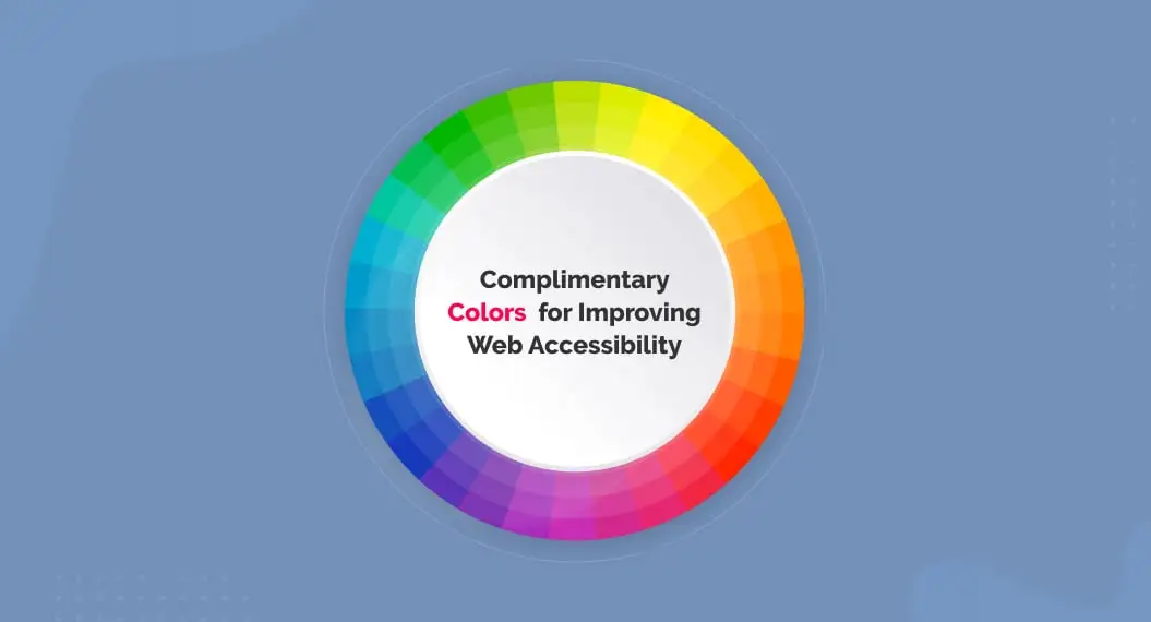
Avoid Giving Instructions Using Colors
For making your website accessible, it is necessary not to provide any vital information
using colors only. For example, when designing forms, you shouldn’t indicate “required”
fields with only colors. Here is what a good and bad form design look like: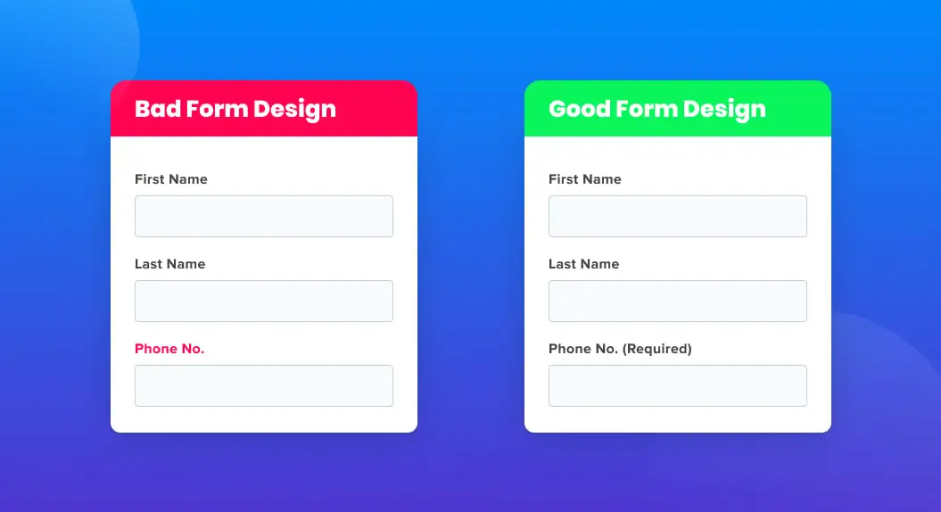
Provide Color Names in Description
Let’s imagine you sell clothes online. For visitors having color blindness, it won’t be
easy to detect the colors of garments on your website. For example, a red dress might
look very different to them.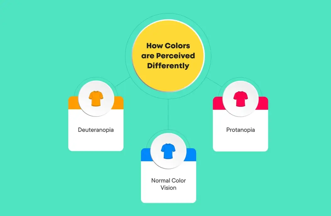
That’s why it is crucial that your eCommerce website provides exact color names in
description to avoid confusion and for making the user experience better and enjoyable. - Design for People with Hearing
LossBecause online stores are mainly a visual experience, you must be thinking about what eCommerce challenges people with
hearing impairment face when using such sites.According to WHO, around 466 million people in the world
suffer hearing loss or are deaf. These people, when visiting eCommerce websites,
confront several problems. For example, people who are born deaf have difficulty reading
the text as they are used to sign language only. Also, they can’t understand the video
content your eCommerce websites produce.But, you can solve these problems with proper design initiatives, including:
- Create Sign Language Videos: This could be one of the web
accessibility challenges for eCommerce store owners. However, for making your
website accessible for more than 466 million people globally, it is crucial.
Consider producing sign language eCommerce product videos for every part of written content on your website. - Provide Video Captioning: You must add subtitles or captions at the
bottom of every product video you produce. These subtitles need to include dialogue,
laughter cues, and even the sound of applause. Video transcriptions should also have
a description of what is happening in the video. And, to meet accessibility
standards, it is also required to be accurate.
Alternatively, you can also consider providing a transcript that users can print to read
later on. The National Association for
the deaf’s website is the best example of designing for people with hearing loss
or deafness. Along with sign language videos, the website also provides a transcript for
every page. - Create Sign Language Videos: This could be one of the web
- Make your Website Accessible by
KeyboardPeople having vision problems or motor disabilities find it easy to navigate a website
using the keyboard only. They have trouble using the mouse or while clicking web
elements that are too close to each other. Therefore, as per WCAG guidelines, all
essential functionalities of a website should be accessible by keyboard.If a website is keyboard accessible, users can use a keyboard to use all its control
elements. A control element can be an interactive function on a web page like links,
forms, buttons, etc.For example, when a user presses a Tab key on their keyword, the focus should shift from
one interactive element to the next in line for better accessibility. In websites that
comply with W3C best practices, focus states are applied to interactive elements when
they get the focus. Here’s an example: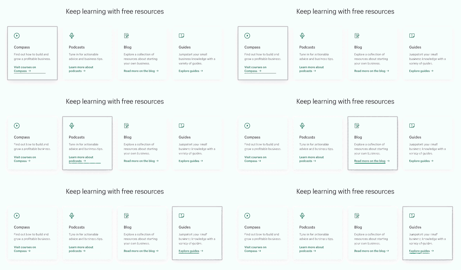
In the above image, the focus element is differentiated by the others with underlined
text, a grey outline, and a little enlarged arrow icon.Also, keyboard web accessibility testing is completely effortless. It does not require
any superior technology, and you can do it manually. Just go to your own digital commerce website and try making a purchase
using the keyboard only. - Use Alt Tags to Define
ImagesHigh-quality and emotions provoking images are the best options for creating an impact in
your user’s mind. However, these images can be an accessibility barrier for blind users
and those having low vision.These users will rely on screen readers or other assistive technologies to comprehend
images on your eCommerce website. Screen readers are programs that read the text on the
screen using a Braille display or synthesizer.But, none of these technologies can read images or text in the pictures. Therefore,
websites let you add an Alt tag for every image you upload to describe it to search
engines and blind users. Therefore, to make your website accessible, use “Alt Attribute”
for a brief description and “Longdesc Tag” for detailed descriptions.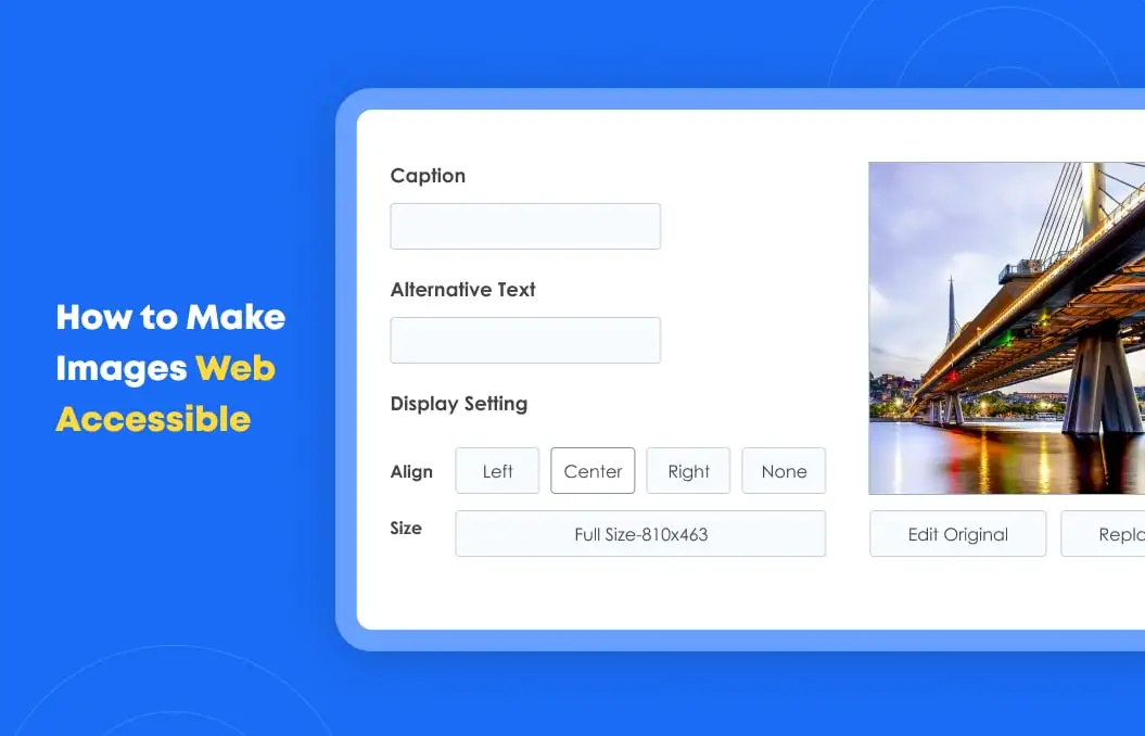
Ensure all Alt tags on your website are clear, concise, and don’t have more than 250
characters. Alt text also helps you improve the SEO of your website by giving search
engines more information to crawl. - Let Users Control Elements
Several eCommerce websites add product images in a slider, video, or as a carousel.
Though these high-quality graphics may look beautiful at first sight, some people might
not be able to comprehend the information you are trying to convey quickly enough to
disappear.Such users may want to see it once again or go back to the previous slide to comprehend
what they just heard or saw. That’s why it is crucial to give users the control so that
they have enough time to understand the provided information.
- Optimize your Content Structure and
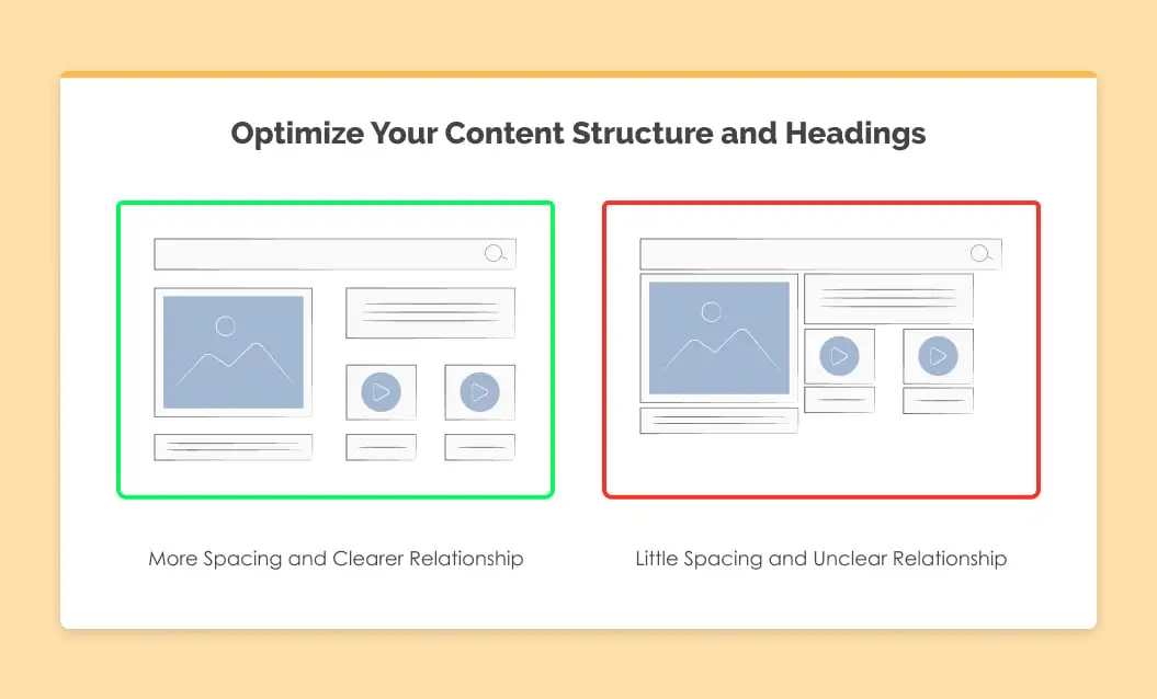
HeadingsFor making websites understandable, it is crucial to make their content organized by
using headers carefully. It won’t just help people with disabilities but will also improve the overall user experience.Just like web crawlers, assistive technologies use headings to quickly navigate a page
and let users jump to a particular section that they find interesting. Additionally, it
is effortless to do it — you just need to make sure you use correct heading tags in your
content. Here are a few tips that will you make your content structure accessible:- Use just one H1 per page — in the page title.
- Headings should always be in order — avoid using H4 directly after H2.
- Use HTML5 landmarks and their ARIA equivalents to designate content areas.
- The size of the text must be easy to read and understand.
- Ensure interactive elements stand out.
- Give users the ability to increase fonts on mobile devices.
- Make sure all website links make sense out of context.
- Make website navigation easy with the help of site search or site map.
- Provide orientation cues such as clear headings and breadcrumbs.
- Style your headings to group content pieces and reduce clutter.
If you implement these accessibility tips while developing eCommerce websites, it will
undoubtedly attract more users with disabilities to your website. These efforts will
result in more conversions and revenues. Let’s now see websites that are already nailing
the web accessibility game.
Web Accessibility
Examples: 3 Websites that are Doing it Right
Now that we know there are legal as well as moral reasons to make your website accessible, let’s
look at three websites that are already doing it right and draw some inspiration.
- Amazon
As one of the leading eCommerce businesses globally, Amazon always makes sure that all
users can have equal access to their products and offerings — no matter what their
disability is. Amazon team’s efforts to maximize their business’ reach (including the
large market of people with disabilities) is one of the many factors behind their
immense success.If you shop on amazon.com, you will find almost all the above-mentioned best practices
implemented on their website. Have a look at how Amazon makes it easy for color-blind
people to shop by adding the color’s name on each thumbnail displayed when the user
hovers over it. Plus, it gives users the control to change and see the product images
from different angles repeatedly.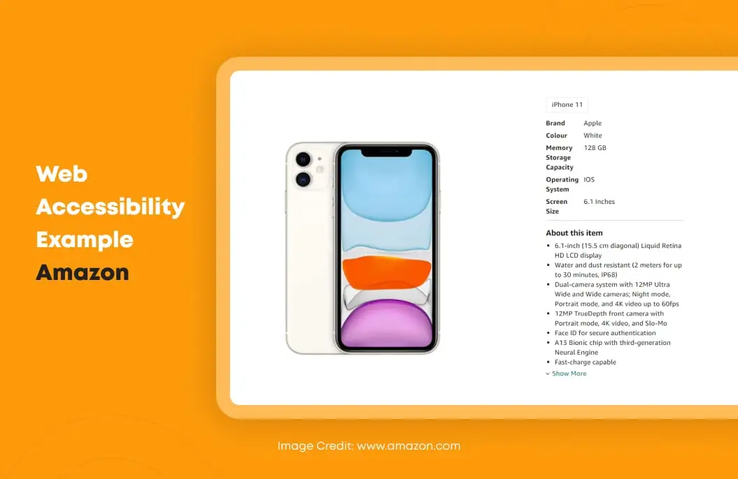
Amazon provides all the information clearly in the text as well for screen readers to
comprehend products and website content. The hues used are vibrant and bold that pass
the accessibility contrast test, and all functionality of the website is accessible with
a keyboard. A win-win for all types of website visitors! - Warby Parker
Website accessibility is an inevitable part of developing a beautiful eCommerce UX. Being
a leading online retailer of prescription glasses and sunglasses, Warby Parker also has
a well-designed accessible website for all its users.All non-text elements on their website have Alt tags, forms have clear labels, colors
used are complimentary, and buttons are clear and well-designed — making Warby Parker a
beautiful yet accessible website.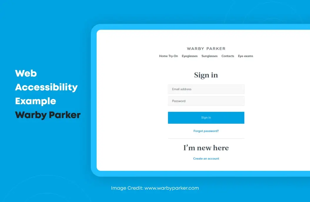
Additionally, they also declared their target of accessibility and how they are adhering
to web accessibility guidelines by publishing an accessibility statement on their
website. - Walmart
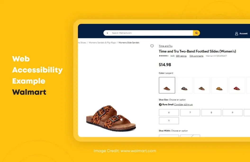
When it comes to world-class retailing, Walmart is the first company that draws our
attention. The Walmart website is also one of the best examples to follow when looking
to achieve web accessibility.The website is easy to use, has clear links, well-structured code, keyboard
accessibility, optimized images, clear, interactive elements, and almost everything
required for those with unique abilities.As the above-mentioned perfect web accessibility examples demonstrate, there is no need
to sacrifice your website’s attractive designs to make it accessible for users with
disabilities. Accessibility and beautiful web designs can coexist. In fact, if you
address accessibility early in design and development, it can drive universal usability
benefiting your users and business.
Conclusion
The demand for accessible eCommerce websites is rising. As people with disabilities can now use
emerging tech to achieve whatever they want, non-accessible websites are rapidly becoming a
matter of the past.
Also, as a reputable and responsible brand, your e-store needs to be accessible by all. Hopefully,
the facts and tips listed in this guide will help you tap into a broader and hidden consumer base
leading to more sales and revenue.
SHARE THIS POST
Table of Contents
Related Resources
- eCommerce App Development Cost: Budgeting In-Depth Guide
- 13 Differences Between B2B and B2C eCommerce Websites
- Top 10 eCommerce Challenges and Easy Ways to Overcome Them
- 3 Types of eCommerce Business Models That Work in 2024
- eCommerce for Business: Is eCommerce Applicable for All Business Types
- eCommerce Customer Journey Mapping - The Secret to Higher Conversion Rates
- What is Headless Commerce? The Ultimate Guide
- Top 15 eCommerce KPIs to Track the Performance of Your Online Business
- Why Your Business Needs a Mobile eCommerce App
- Omnichannel Retail Strategy: A Comprehensive Guide
- Omnichannel vs Multichannel Retailing: The Complete Guide
- What is eCommerce Order Fulfilment? (And 6 Steps to Improve the Process)
- PCI Compliance: Everything You Need To Know
- The BEST Guide to eCommerce Personalization
- 12 Essential Factors for Choosing the Best eCommerce Platform
- The Ultimate Guide to Product Information Management (PIM) Systems for Ecommerce
- What is a Product Recommendation Engine (And How it Helps Boost Sales)
- eCommerce Replatforming: Challenges, Benefits, and Best Practices
- The Ultimate Guide to eCommerce Security
- Top 13 eCommerce Trends in 2024
- How Voice Search will Transform the Future of eCommerce

