B2B (business-to-business) eCommerce is increasingly driven by shifting demands of business buyers, who expect more personalized, transparent, and self-service capabilities than ever before. Unfortunately, 85% of B2B buyers think their eCommerce user experience (UX) should be better, given the amount of information businesses collect.
If you are experiencing high bounce rates, low conversion rates, or are receiving complaints about your eCommerce website’s usability, this guide will help you understand how the right B2B eCommerce UX design can help you increase buyer satisfaction, streamline the buyer’s journey, and drive revenue over time.
Key Takeaways:
- The B2B buying journey is complex, requiring an approach to design and functionality that differs from B2C eCommerce stores
- An increasing number of B2B buyers expect personalized experiences
- B2B buyers need trust, high levels of service, and information tailored to their role in the purchase decision
- Curated UX design combined with artificial intelligence can unlock higher conversions, sales and loyalty
Net Solutions offers expert B2B eCommerce development and UX design services, helping create eCommerce sites that strengthen trust, engagement and loyalty.
What Is B2B eCommerce UX?
User experience (UX) in eCommerce represents all the perceptions that a buyer makes when interacting with an eCommerce store across all channels. In B2B eCommerce, UX design is the process of creating a seamless website experience that supports all stages of the B2B buyer’s journey.
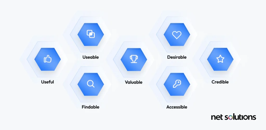
The core elements of UX design focus on making the eCommerce website useful, usable, desirable, findable, accessible, and credible.

How these elements apply in B2B differs greatly than in B2C (business-to-consumer) because the B2B buyer’s journey is more complex. As a result, B2B UX design is about creating a strategy that addresses the nuanced differences of the B2B buying journey.
First, we’ll explore why user experience is important for B2B eCommerce businesses before diving into how B2B UX differs from B2C UX.
Why Is User Experience Important in B2B eCommerce?
A B2B eCommerce store that has strong UX is able to effectively communicate the right information at the right time to each persona to help convert researchers into buyers and keep buyers coming back year after year.

Of course, the opposite is true for poor UX in B2B marketing. A poor UX makes it hard for users to find information, leading to higher drop offs across the buyer journey, and lower rates of conversion. Sadly, UX also impacts buyer satisfaction, with 90% of buyers willing to switch to a competitor if they offered a better online experience.
With word of mouth critical to B2B sales, directly influencing trust and credibility, what your buyers have to say about user experience can make or break future sales.
What Are the Key Differences Between B2B and B2C eCommerce UX?
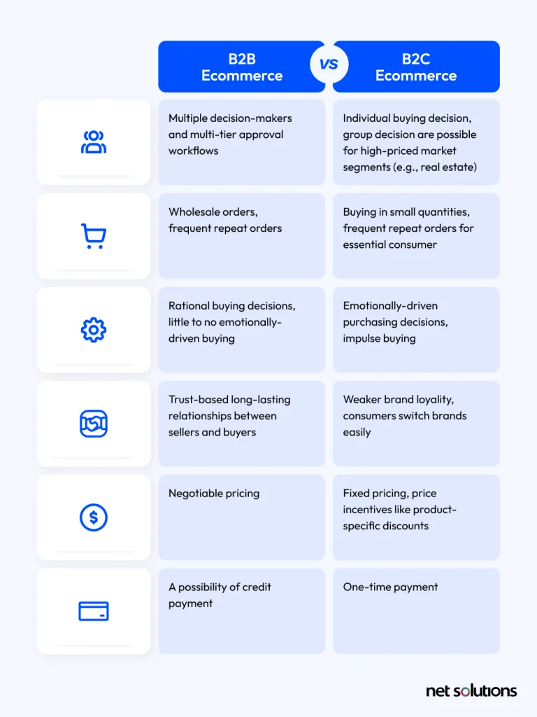
The buyer in B2B and B2C has a big impact on the approach to UX. In B2B, businesses are selling to other businesses (which often includes many people in the decision), while in B2C, a business is selling to a single individual consumer.

The implications for this difference impact many areas of UX:
- Content: In B2C, purchases are impulsive based upon product details or perceived value. In B2B, purchase decisions are prolonged based upon content designed to solve problems, communicated in depth to multiple stakeholders.
- Design: In B2C, design is visually appealing, simple, and focuses on emotions. In B2B, decisions are more rational and information-based, site design must focus on trust and professionalism, including features that highlight information across the buying journey, with multiple ways to engage with sales.
- Pricing: In B2C, pricing is universally the same, while in B2B, pricing may include alternative B2B eCommerce pricing strategies (dynamic, tiered) and customer-specific pricing. How this information is displayed can impact trust.
- Catalogs: In B2C, there is one product catalog, but in B2B, there can be very large or differentiated catalogs, with an additional requirement for downloadable product information and advanced search and filtering capabilities.
- Checkout processes: In B2C, transactions are completed online using payment gateways, while in B2B, the sales process may involve more steps, including demos, phone calls, a RFP or quote, approval cycles, invoices and additional payment methods.
- B2B account management is more complex: In B2C, customers can create accounts to view past orders, ask for refunds, create wish lists, or re-order items. In B2B, account management includes assigning roles and permissions, quotes, invoicing, payments, approval cycles, discussions, shopping lists.
As you’ll see from the above, some of the needs of B2B buyers create complex challenges for eCommerce UX design.
What Are the Challenges of B2B E-Commerce UX Design?
You can’t just choose any eCommerce platform or template and expect it to support the complex needs of B2B eCommerce buyers. Instead, the right B2B eCommerce platform and your approach to B2B eCommerce Website Development must address the following B2B eCommerce challenges and pain points:
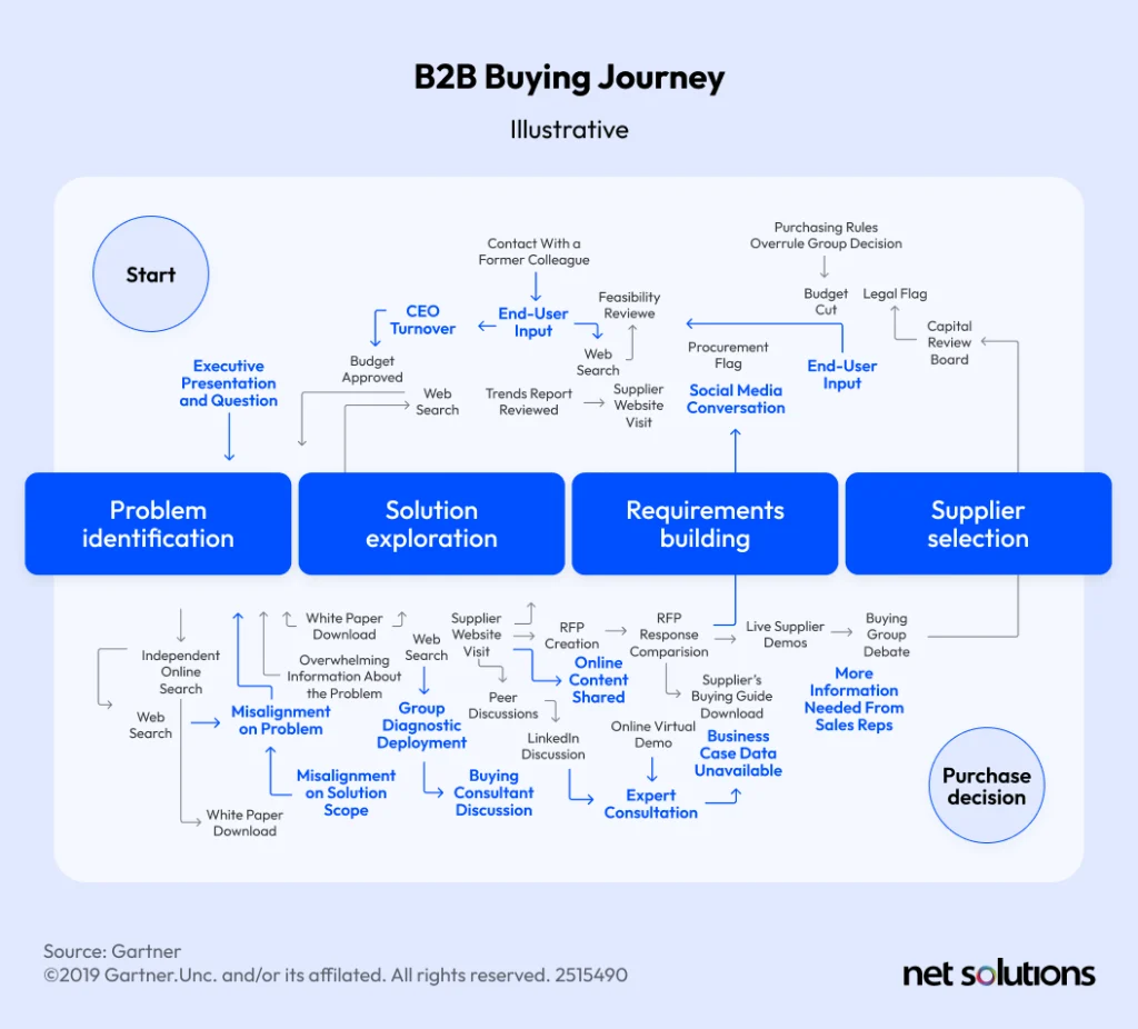
- The B2B buying journey is long and involves many decision-makers: In B2B, the UX must support all stages of the buying journey and multiple stakeholders (an average of 6-8). UX design involves supporting this wealth of educational content and in-depth product information.

- Service quality is everything: 82% of business buyers make purchase decisions based upon customer service quality. UX design makes decisions about how to display information (gated or ungated assets, self-service portals, knowledge bases) and how to interact with service, e.g. live chat (text, video) and in-portal messaging.
- Personas have different needs: Different stakeholders need different kinds of information and in different formats. The UX design process needs to figure out how to organize, trigger and display this information.
- The need to simplify the complex: Large and differentiated catalogs and pricing and/or complex products challenge how information is organized at the site and page level.
- eCommerce isn’t standalone—yet: 80% of all B2B sales interactions will move to digital channels by 2025, increasing demand on UX designers to simplify interactions including live chat (text, video) and self-service portals.
- UX designers need to know about B2B processes: UX designers need to understand B2B processes to make them simpler, working with analysts and developers to automate and improve workflows.
The following best practices can help UX designers navigate these challenges and create experiences that inform, delight, and convert.
Essential B2B eCommerce UX Best Practices
The following best practices can help B2B companies improve their eCommerce efforts across channels:
Implement intuitive navigation and information architecture
Design a logical site structure that reflects how different B2B buyers will be searching for information across B2B eCommerce websites.
In general, best practices include:- Clear navigation menus using the ‘hamburger’ menu button, organizing by industry, product, solution, or resource type
- For differentiated catalogs, this may include catalog-specific navigation hierarchies or customer hierarchies.
- Clear, not overly complex information architecture for primary pages (although other content can be navigated to within pages or via search)
- Strong landing pages to direct specific search results
- Leverage breadcrumb navigation as an added feature to display where users are in the website (e.g. home >> solutions >> specific landing page)
- Leverage AI-powered personalization to optimize the order products are displayed on category and search pages, include recommendations, or display specifc content or promotions
Offer robust search functionalities
Help B2B buyers find what they want quickly and easily. Best practices for B2B customers include:
- Prominent search bar
- Autocomplete, autocorrect, synonym support, or suggested alternative searches
- Broad search term support (SKU, category, product name, part, etc)
- Advanced filtering
- Mobile-friendly search
- Dynamic search ranking (e.g. based on popularity, promoted products, etc)
- Personalized search ranking (AI-learned behavior, location, history)
- Optionally include related, recommended or most popular search results
Optimize product pages
Category and product pages should be optimized to ensure they have all the required information, are visually appealing, and are well organized to support the customer experience. Best practices include:
- Include high quality images, optimized for mobile and SEO
- Include diagrams or video, where complexity demands
- Include downloadable technical specs or product sheets
- Streamline complex information with the use of expandable menus
- Offer up-sell or cross-sell opportunities
- Include social proof (case studies, quotes, ratings)
- Include transparent pricing or shipping information
Streamline the checkout process
Make the checkout processes simple to convert and retain buyers:
- Reduce the amount of information / number of steps
- Offer a clear path to RFP, if appropriate
- Include transparent pricing, shipping (single and multi-location), tax costs
- Support multiple payment methods (credit, check, wire transfer, ACH payments, and virtual cards)
Provide account management and self-service options
Having a strong self-service portal is critical, making it 47% more likely to meet performance goals. Tools include:
- Support for multiple buyers in an organization, with differing purchasing capabilities based on assigned roles and permissions, and sub-organizations (e.g. locations, brands)
- Order management (manage quotes, easy reorder, bulk order, order history, modify order details, tracking, approval workflows)
- Shopping lists and shared shopping carts
- Direct access to sales and/or customer service support
- Personalized pricing and discounts
Make bulk ordering, configurations and product customization easier
Bulk orders, configurable products and custom ordering can create unique demands such as volume-based pricing, custom product display, and more complex fulfillment options (e.g. from more than one warehouse or supplier). UX designers must find a way to display and simplify these processes, including:
- Quick reorder options (shopping lists, upload order from CSV)
- Transparent volume pricing
- For custom products, build-in approvals, comments, or feature alterations
- Simplify configurable product displays over multiple pages, via easy menus, or tabs with in-page experiences such as changing images. Allow configurations to be saved.
- Streamline customization options (e.g. custom design, configurations, branding)
Optimize for mobile
Optimizing an eCommerce store for mobile devices may involve responsive design, a progressive web app (PWA), a dedicated mobile app, or multiple front-ends (headless commerce), each of which may have different UX considerations. In general, best practices include:
- Support for native browsing preferences (dark mode and light mode) and gestures
- Accessibility features (voice search, alt text for images)
- Greater attention to white space, bold typography, shorter CTAs
- Collapsible menus
- Optimize forms, checkouts and logins, including one-click checkouts, passwordless and passkey logins, and auto-fill forms.
Learn more about B2B Mobile eCommerce and other B2B eCommerce trends.
Simplify the re-ordering process
One of the ways to increase the lifetime value of your customers is to make it easy for them to keep ordering from you, such as:
- Reorder from history or shopping lists
- On-page recognition that a product has been ordered before
- Set up subscriptions, allowing a regular cadence of the same product(s)
Optimize for omnichannel
Today’s B2B buyers use up to 10 channels during their purchase decision, including websites, mobile apps, self-service portal, social media, requiring an eCommerce UX strategy that is consistent across channels. Today, that’s often achieved using headless commerce.
B2B eCommerce UX Ideas that Convert
While UX designers have many things to think about when creating experiences that cater to B2B buyers, there are a few additional things that can go the extra mile in helping to support sales and marketing efforts.
Encourage lead capture in multiple ways
There is a fine line between encouraging lead capture and forcing lead capture. Too much gated content or too many requests for information may sour the experience, while too few can result in missed opportunities to capture leads.
- Provide many ways for buyers to get in touch (email, call, set up a meeting, live chat)
- Incentivize the lead capture (sign up for a webinar, eBook, gain access to an ROI calculator, limited deals)
- Be subtle in the placement of lead captures
- Use intelligence to target content and offers tied to lead gen capture (e.g. a webinar or course is ideal for those in early problem identification)
- Consider tiered pricing and/or free trials
- Balance the number of fields to be useful for lead scoring but not overwhelming for buyers
Design for product discovery
While B2B buyers are usually on the lookout for a specific product or solution for their problem, there is still the opportunity to up-sell or cross-sell during the process.
- Include industry pages that display multiple solutions
- Feature recommendations based on complementary products, featured or complimentary products
- Use intelligence to arrange catalog and search pages to optimize for conversion
- Create bundled solutions or pricing tiers that encourage upgrades
Disclose prices and availability
Today, 29% of B2B purchasers state that a lack of pricing information is a hurdle to online purchasing, so first and foremost it is critical to disclose prices and real-time availability, including information related to taxes and shipping costs, or to offer a quick path to get this information. Considerations include:
- Using form prices, with the option for differentiated prices upon request
- Displaying approximate time to response or using live chat for quotes
- Offering various shipping options based on size, number of shipments, or shipments to multiple locations
- Displaying actual quantity of stock vs “high” or “low” availability
- Options to be notified of restocking
Measure and improve the performance of your B2B eCommerce UX
As with any UX design project, metrics are the key to success. These can come in the form of:
- Site analytics for common KPIs, e.g. average time on site, bounce rate, cart abandonment rate, conversion rate, customer ratings
- A/B testing to test variations of UX web pages to see which performs better
- Usability testing and surveys to gather feedback and find areas for improvement
UX best practices are constantly evolving, following trends and adapting to new technologies. Regularly gathering feedback can help ensure your B2B eCommerce business remains relevant, converting, and profitable.
The Bottom Line
We hope this guide has helped demystify the differences between B2B and B2C UX and helped provide some actionable steps to help you optimize your B2B storefront to reap all the benefits of B2B eCommerce.
Ready to deliver a B2B eCommerce experience that establishes trust and helps your business scale? Partnering with Net Solution gives you the advantage of an established user experience design and eCommerce development company.
SHARE THIS POST
Table of Contents
Related Resources
- AI in B2B eCommerce: Everything You Need to Know
- Top 14 B2B eCommerce Benefits in 2024
- The B2B eCommerce Catalog: Everything You Need to Know
- The Biggest B2B eCommerce Challenges (And How to Address Them)
- The Ultimate Guide to B2B Fashion eCommerce: Strategies, Trends, and Solutions
- 18 Must-Have B2B eCommerce Features To Look For in 2024
- Headless B2B eCommerce - How to Redefine Your Business
- B2B eCommerce Marketplaces: Your In-Depth Guide
- Top B2B eCommerce Metrics to Track for Success [2024]
- B2B Mobile eCommerce - A Comprehensive Guide
- Why Your Business Needs a B2B eCommerce Mobile App
- 11 Top B2B eCommerce Open Source Platforms for 2024 [With Real Reviews]
- B2B eCommerce Platform Costs: A Comprehensive Guide (2024)
- 12 Top B2B eCommerce Platforms for 2024 [With Real Reviews]
- B2B eCommerce Pricing Strategies: An In-Depth Guide
- Your In-Depth Guide to B2B eCommerce Replatforming
- Top 9 B2B eCommerce Trends to Watch in 2024
- A Step-by-step Guide to B2B eCommerce Website Development
- 9 of the Best B2B eCommerce Website Examples in 2024

