94% of first impressions these days are design-related. Even the most useful website or product is rendered powerless if integrated into a poor or obsolete design. That’s why it’s essential for us to closely track UX design trends and incorporate them into our websites/apps. This way, we can offer the best experience and convert first visitors into loyal customers.
Here we present the latest UX design trends for 2024 to make your design look attractive, contemporary, and clean.
Top 22 UX Design Trends for 2024
User experience design changes the way how a customer perceives your brand. It is, in fact, the fundamental parameter behind increased traffic and conversions later on.
To make your web, app, and product UX look and feel fantastic, there is a need to engage users with key UX elements and track the latest UX trends that continuously evolve. And when it comes to taking proper leverage of these UX design trends and experience design, only an experienced and well-versed UX Design Agency can help. To start with, here are the modern UX design trends that dominate or will monopolize the market in the times to come.
1. Anthropomorphic Animations
Animations are not new in UX design. But all thanks to some interesting trends, we are seeing them becoming more organic, fluid, and impressive. One such trend is anthropomorphism, and it is all set to become one of the top UX design trends in 2024.
Anthropomorphism is the attribution of human emotions, characteristics, and intentions to non-human objects. UX Designers can incorporate this characteristic into animations to turn abstract shapes into likable animated characters that mimic human-like moments.
Human beings are naturally attracted to objects that mimic them visually and behaviorally. Hence, they connect better with anthropomorphic animations. It leads to more engagement and a more immersive user experience.
2. Password-Less Login
Sometimes passwords can leave you more confused than secure. At least it seems to be the case with many people as suggested by a survey of 2005 Americans commissioned by LastPass last year.
According to the survey, 57% of people forget their passwords immediately after resetting them. 65% feel the need to write their password something so that they don’t forget it the next time.
So, we can say that forgetting a password is a customer’s pain point that you need to address.
The real problem lies with password-setting protocols that oblige a user to include special characters, numerals, or upper and lower case characters. Though mandatory for security reasons, these requirements only add to the complexity and lead to users having to reset their passwords frequently.
A simple solution is to transition to “passwordless” logins, i.e., logging through Google, social media accounts, fingerprints, iris scans, or phone unlock patterns.
It is one of the emerging UX Design Trends that various big brands are already implementing.
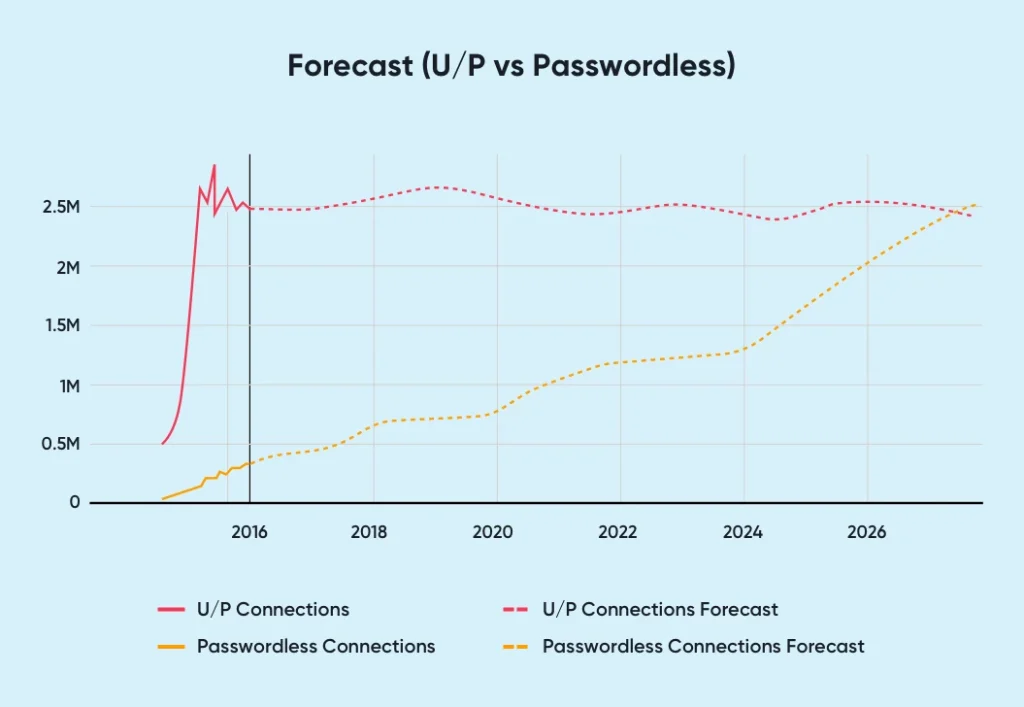
Although it was not as popular as other login forms before 2016, this concept is growing gradually. It is forecasted to overtake passwords as the primary form of login within six years.
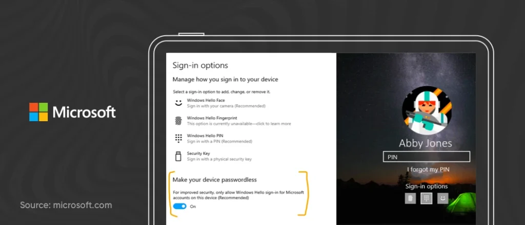
Microsoft has worked on removing passwords from Windows 10. Microsoft’s Windows 10 Version 2004 introduced “Windows 10 Hello,” a biometric system to sign in. After turning on the setting, users can sign in using fingerprint, iris scan, face scan, or a pattern. It implies that PCs will use Windows Hello face authentication, fingerprints, or a PIN code.
3. Individual Learning
The internet age is the greatest blessing for learning enthusiasts. It has made sure learning is not confined to classrooms. Instead, anyone who wants to upgrade themselves or pursue a new career path can easily access it. As a result, online learning has become a mainstream trend.
However, one drawback of online learning is that it depends entirely on learners. In the end, they will have to motivate themselves and finish the modules on time.
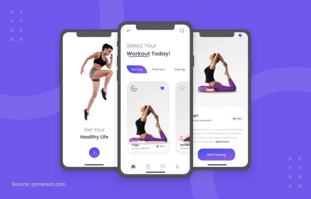
But UX is changing the scenario. Remote feedback, psychological tests, matchmaking technology, and scheduling tools – it is ensuring learners remain hooked for a long time. They can now even track their progress, set goals, and learn from their mistakes.
We will get to see individual learning becoming more popular in 2024. It will bridge more gaps and replace crowded lectures with a 360-degree, immersive learning experience.
4. Escapism
While the COVID pandemic took away the comfort of traveling and forced all of us to stay at home, it also uniquely inspired UX designers. When they understood people couldn’t travel, they started channelizing their creativity to create unique virtual experiences.
It led to a new UX design trend called Escapism, which has amassed popularity for the last two years. We see websites featuring organic color schemes, gallery-laden scrolling websites, large hero images accompanying a creative copy, and exotic locations that evoke the escapism feeling.
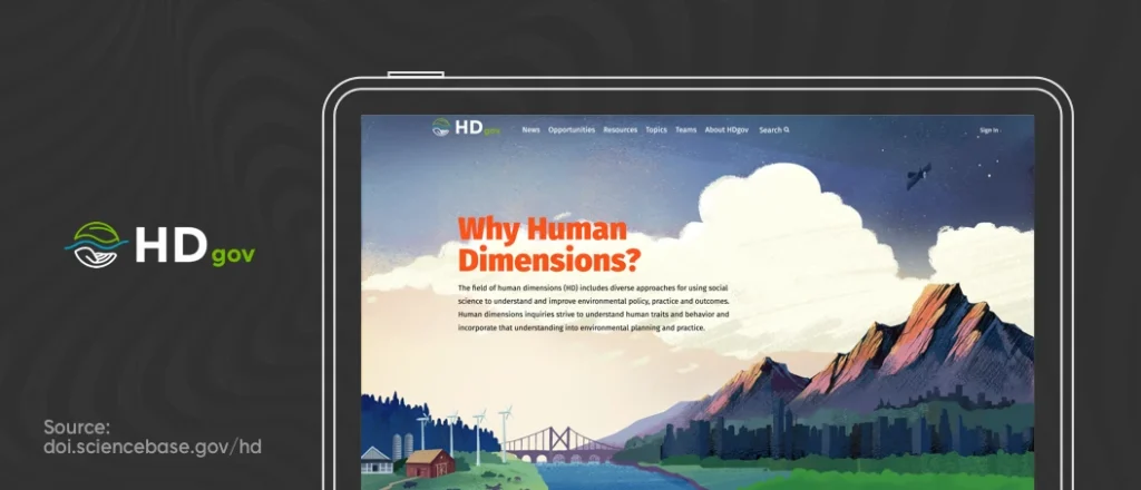
As we are slowly trying to progress back to normal, Escapism will go nowhere. We’ll still get to see new web UX patterns featuring exotic locations where we would want to live.
5. UX Writing
Creative and intentionally decorated words do not work anymore, as it only adds to the fluff.
People want to hear to-the-point information that will bring them value, which, in turn, will lead to more customer engagement and conversions.
UX writing or aptly a “Microcopy” is all about using short sentences that help users understand where they are, what they need to do, the brand story, and how the brand can help. It is about saying less while expecting to make a more significant impact.
The proper microcopy can build an iconic brand and an unforgettable user experience for your customers, alongside improving conversions anywhere between 14.79% and 166.66%. — Joshua Porter, Father of Microcopy
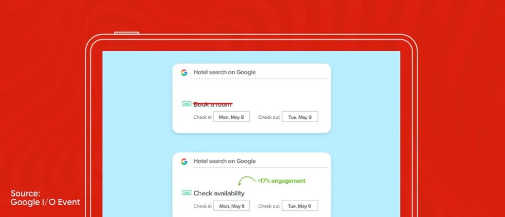
For instance, Google analyzed that their potential users are more inclined to browse hotel room options casually and are not in the headspace to make a reservation right away. Thus, they changed their copy “Book a room”—which was not empathetic— to “Check availability”—an appropriate microcopy for the intent at the time—which increased the engagement rate by 17%.
Here are some tips to make your microcopy stand out.
- Stick to the point and do not beat around the bush
- Provide an objective to the user before they proceed further to explore more
- Try and directly address the user by not generalizing things
- Incorporate “present tense + active voice” in your microcopy
- Using numerals when required is undoubtedly a good practice
6. Air Gesture
Gesture control is a new mobile design trend that promotes the use of body gestures to perform an action — for instance, a user showing a palm gesture in front of the camera to capture a selfie.
Since the advent of touch screens, a lot has changed, which is evident from the mobile interfaces’ increasing touch screen aspect ratios. Increased aspect ratios mean fewer bezels in the front, which, in turn, means a better gesture experience.
Although Apple initially introduced gesture control technology in iOS, the new UX trend (air gesture) takes this technology to the next level. You can wave your hand or pinch your fingers in the air to make stuff happen on the phone without using touchscreens.
Google has even added facial gesture control features in its Android 12 beta. It means now you can control your phone with facial expressions like smiling, raising eyebrows, or opening your mouth. Want to see the feature in action? Here you go:
Now that we know the possibilities of air gesture, we can say those gesture possibilities showcased in Fifteen Million Merits–one of the most popular episodes of the Black Mirror series–will soon be a reality.
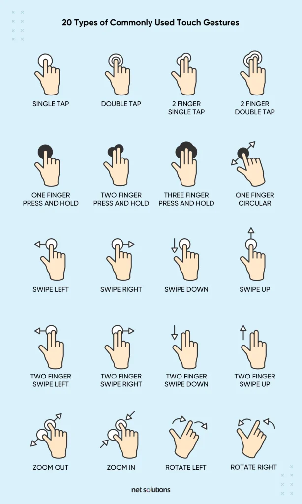
The most significant advantage of using gestures lies in its intuitiveness and sensitivity to touch. Thus, touch gestures will always play their part, no matter how far the ‘Gesture Trend’ goes.
Here’s an example of different touch gestures that should be a part of any UX developer’s to-do list.
7. Inclusive Design
Designing for one and all is where the true essence of inclusive design lies.
Inclusive design is a design methodology that enables and draws on the full range of human diversity. — Microsoft
To be precise, inclusive design is a cooperation of ideas and expectations of people from all walks of society having varied perspectives.
If a designer solves a problem from his perception, it might work for some, but not everybody. So, what do we do to change that?
The answer is simple: Work on a physically, cognitively, and emotionally suitable design for everyone.
There are three principles around which an inclusive design revolves.
a. Recognizing Exclusion:
It is about understanding whose perspective is included in your UX design and who gets excluded. Once your team understands the design requirements, they will have a clear picture of their key responsibilities.
b. Solve for One, Extend to Many:
Designing for accessibility, i.e., for people who deal with one disability or the other, should get priority. When a UX trend such as this addresses the needs of people with permanent disabilities, it benefits people globally.
c. Learn from Diversity:
Design thinking plays a significant role in including diversity. This principle puts people in the center from the beginning so that the design strikes the right chord in the first instance.
If you implement this UX Design Trend, businesses are expected to reach four times the number of intended consumers.
8. Material Design
Since the advent of material design in 2014 by Google, user experience designs have witnessed a new facet in the form of responsive animations, 3D icons, light and shading features, transitions, and padding.
Material design is a “Design Language System,” which is all about bringing the material to life!
Unlike real paper, our digital material can expand and reform intelligently. Material has physical surfaces and edges. Seams and shadows provide meaning about what you can touch. — Matias Duarte, VP of Material Design at Google.
Last year, it was “moooi” that bagged the award in the category of Material Theming, thereby changing the face of UX trends for good.
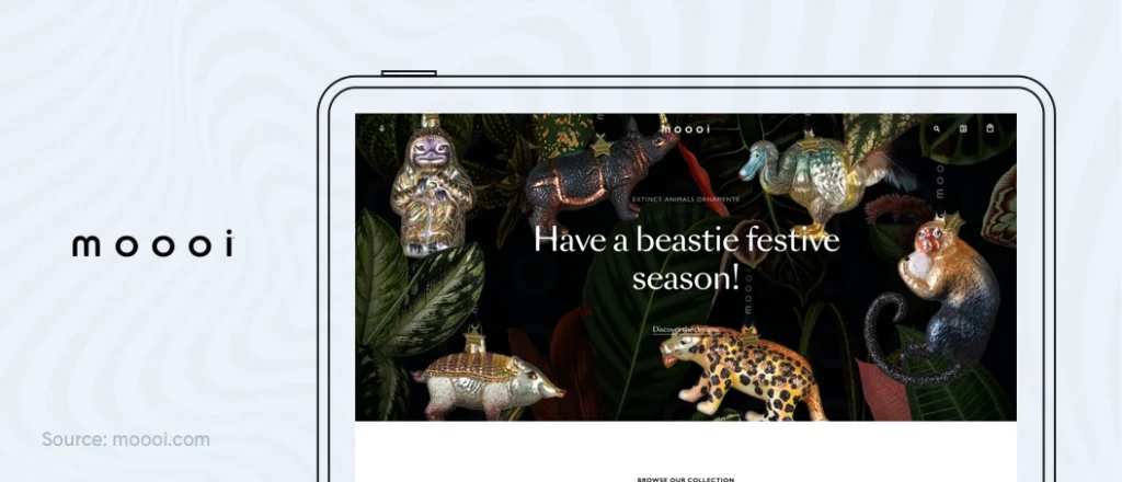
Material designs will keep evolving to give better-detailed textures and patterns, personalized User experience, along with increased intuitiveness and an engaging user experience.
9. Virtual and Augmented Reality
Virtual reality and augmented reality have come a long way from just being a future possibility of real-life implementation.
This technological advancement has become one of the latest UX industry trends and will continue to be in the coming years.
The market size of AR is expected to grow at 85.2 CGAR between 2016-2021.– Zion Market Research
We have seen that with the changing times, AR is not just restricted to gaming but has spread its wings to other sectors as well. Some include AR in retail, travel, automobile industry, education, healthcare, and social media platforms.
This year we witnessed a significant movement when neurosurgeons from Johns Hopkins University performed their first AR surgery on patients. You can see the video yourself.
10. Biometric Authentication for Secure UX
Biometric authentication is here to make devices secure and prove to be a significant UI and UX trend of 2021 and beyond.
It is one technology that can embrace a security-first approach for both the businesses and the end-users, thus improving User Experience substantially.
The promising biometric authentication market is an innovative technology that has been giving identity to people without being at risk of being impersonated.
The projected US biometric market revenue for 2022 is 1.24 billion USD. – Statista
The various innovative biometric technologies blooming in the market include iris scans, facial recognition, voice, and even vein pattern recognition.
If your business needs a password for authentication, move on to iris scans next. If you have an iris scan authentication in place, move on to facial recognition next. The idea is never to stop advancing and keep innovating.
Google has been a pioneer in this regard. They added biometric sign-ins to some of their web services. It means that now, one can sign in using fingerprints, PINs, or even usual unlock patterns.
You could also go through this video by Google Developers for more information.
11. Advanced App Onboarding
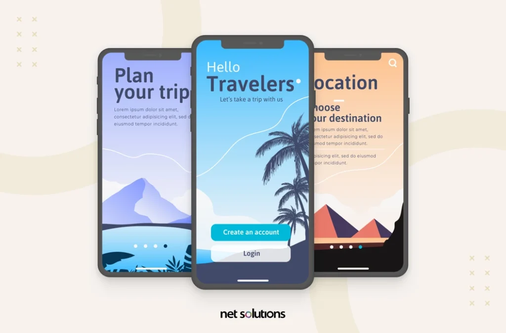
25% of people delete apps only after using them once, and a common reason behind it is that users fail to see any value in them. If it is not clear what your app does and what value users can derive from it, you risk losing them. Hence, onboarding is a crucial aspect of a customer’s journey. Not only does it make customers feel welcomed, but they also get familiar with it.
Keeping this in mind, companies are taking onboarding seriously and combining it with interactive UX design elements that offer users an immersive experience.
Advanced onboarding is a new UX design trend. These days, most apps come with self-explanatory screens on how it works. It has led to good UX and more customer engagement.
12. Bold Typography
In a time when the human attention span has significantly decreased (8 seconds), keeping users hooked on your website/app is a big challenge. That’s why brands are now opting for large, bold typography in 2024.
Here’s how the bold typography helps brands:
- It makes the content scannable as people on the internet usually don’t read but scan the information.
- Bold Typography helps designers convey information in the most concise manner.
- Bold Typography also captures the audience’s attention and helps them focus on the correct information.
The approach while using bold typography is to keep the design minimal so that the app/website doesn’t look overcrowded. Brands also use animations to spice up the designs.
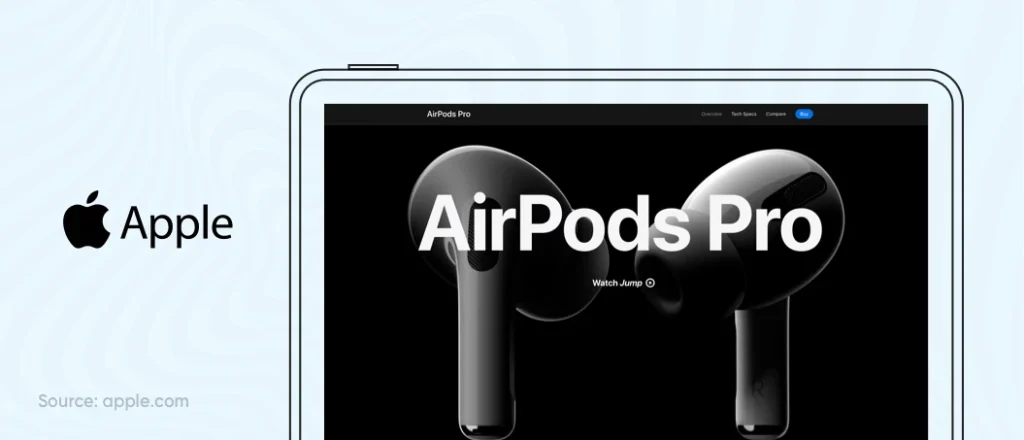
It would be best to consider how different typefaces will respond while leveraging this UX trend. Some typefaces may not look good on some devices and result in adverse impact for users.
13. Immersive 3D Visuals
While 3D visuals have been around for a while, they were not much practically in use as they dump a heavy load on user machines. However, things will change this year as modern front-end frameworks can significantly reduce page load time.
Designers can now keep the 3D objects more detailed and more extensive. They can even include shadows, animations, or layer effects to create depth and dimension in their designs.
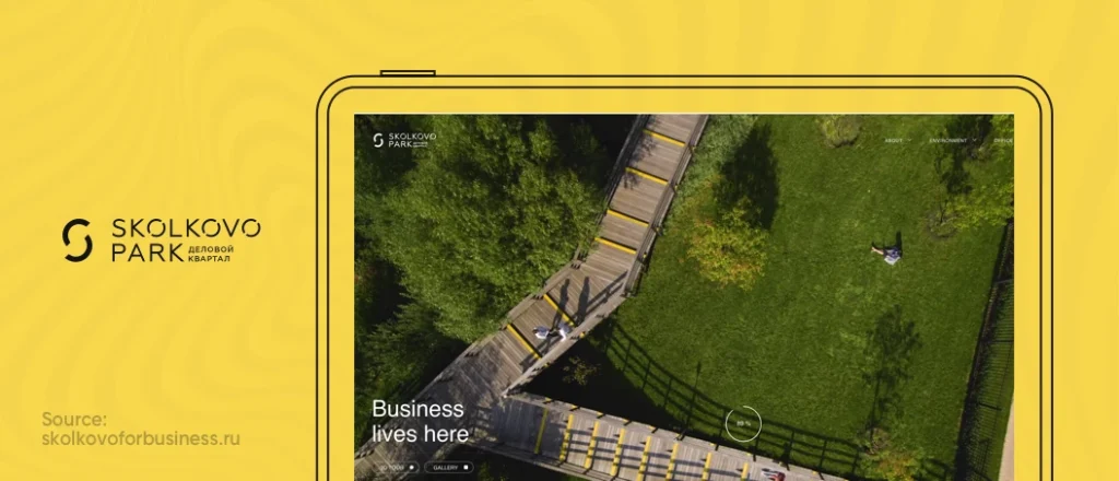
We will also see more cool 3D designs and effects on websites/apps, leading to a unique and engaging user experience. From real-life web models to in-depth video/photo illustrations, brands will use all types of immersive 3D experiences to offer in-depth understanding or keep users hooked. They will also leverage the UX design trend for visual storytelling.
14. Scroll-triggered Animations
The use of scroll-triggered animations is another interesting UX design trend we have noticed in the last few years, and it is supposed to get even more popular in upcoming years.
Not only do scroll-triggered animations keep users hooked, but they also make a significant storytelling element. Hence, even famous brands like Apple use them on their website to display products like telling a story. They engage users so that they feel they’re a part of the brand and the story it is telling.
Any brand that wants to offer immersive digital offerings through visual storytelling must adopt this promising UX trend. Just keep in mind that animations don’t deflect from your goal or confuse users.
15. Blurred, Colorful Backgrounds
The UX trend of using different color gradients has been popular for a long time, and it is still mainstream today.
However, recently we have noticed that gradients are now becoming lighter. At the same time, they are also becoming more colorful. While earlier UX designers used 2-3 colors in linear gradients, they’re using up to ten colors and adding additional overlays on top. It has led to a new UX trend of using blurred, colorful backgrounds.
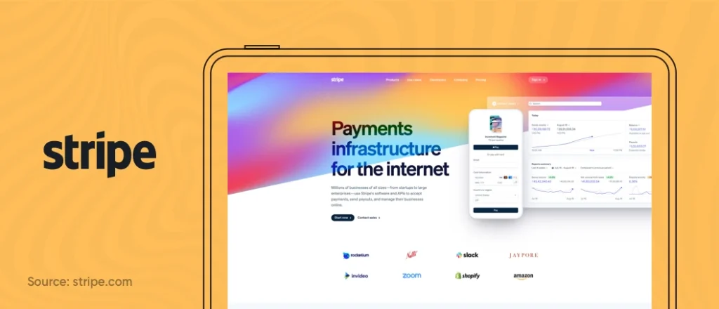
The blurred, colorful backgrounds are becoming popular because they evoke various emotions. Moreover, they communicate a warm and welcoming feel. Perhaps, that’s why even the most popular brands like Stripe use them on their website.
To make the most out of this UX trend, ensure you choose colors that highlight your brand and look good. You can even mix them with UX trends like glassmorphism to give your website/design a unique feel.
16. Glassmorphism
While Neumorphism is still mainstream, another UX trend is amassing massive popularity. It is called glassmorphism.
Glassmorphism can be defined as a design that emphasizes light or dark objects placed on colorful backgrounds. You can quickly identify glassmorphic designs with their semi-transparent background featuring sublime shadow and border.
Here are a few other critical characteristics of glassmorphism:
- A frosted glass effect using background blur
- Multi-layered approach with objects floating in space
- Vivid colors that highlight the blurred transparency
- The subtle light border on translucent objects
In glassmorphism, a design looks like a virtual piece of glass with objects placed in multiple layers. Here’s an example:

Glassmorphism style takes inspiration from the design concepts introduced by Apple back in 2013 with iOS 7. Apple brought the trend back with its Mac OS Big Sur update in 2020. This trend is popular because it can help designers efficiently add depth to their designs and establish a clear visual hierarchy.
To make the most out of the Glassmorphism UX trend, you should keep the following things in mind:
- Use it on light and colorful backgrounds. The design looks best on them
- Do not overuse glassmorphism. The style works the best when you use it on just one or two elements
- Give a proper dimension and borders to your design elements to give the illusions of floating glass
- Use glassmorphism by keeping the website accessibility in mind. Icons designed in this style are already controversial. Using this trend in the wrong way can do more harm than good
17. Abstract Geometry, Illustrations, and SVGs
While 3D animations are supposed to be the star of 2024, another UX design trend is slowly picking up pace. We see more and more UX designers experimenting with abstract illustrations, absurd proportions, SVGs, unusual angles, and bright colors.
The primary reason behind using these illustrations is that they make a website/app stand out from the rest of the crowd. Besides, they create a friendly environment that captures users’ attention and ensures the best user experience.
To make the most out of abstract images and SVGs, combine them with motion design. It will make your website/apps come to life, giving them their own personality and making users remember them for a long time. Also, make sure you are testing these illustrations keeping the end goal in mind. There is no use if they don’t solve the purpose and lead to unnecessary confusion.

We respect your privacy. Your information is safe.
18. Device Agnostic Experiences
Earlier, Mobile-first used to be a primary approach followed by UX designers. However, as more devices are emerging, the focus is slowly shifting towards device-agnostic experiences. UX designers are now designing experiences keeping all devices in mind.
The primary reason behind this shift is that consumers want freedom and flexibility nowadays. They want to be able to shift between devices without any hassle quickly. Hence, it becomes essential for UX designers to create experiences keeping the complete user journey in mind. To make the most out of device-agnostic experiences, think of the customer journey as a whole. Think of devices as various checkpoints through which users will interact with your brand. You need to ensure they can complete this journey without any friction.
19. Motion Design
A well-designed motion effect can tell a brand story better than a static image or plain text. People love animations as they can add an exciting element to otherwise boring website designs.
It has led UX design agencies to combine a minimalistic design with engaging & bold animations to create immersive design experiences. As a result, a new trend called motion design has emerged. Such designs keep users hooked and release their tension to prepare them to consume large volumes of professional information.
While scroll animations can be a beautiful addition to any UX design, brands should avoid doing them for decorative purposes alone. Instead, they should solve a problem by explaining something, simplifying a problem, or speeding up the iteration process. Only then can they create a Wow effect.
20. Advanced Personalization
Personalization has always been an essential UX design element. But companies are now taking it up a notch by delivering highly targeted and personalized experiences on their screens. You might have noticed how you receive personalized music suggestions on Spotify and movie recommendations on Netflix. You might have also stumbled across products that you search for or wish to buy on your Amazon account. These all are examples of advanced personalization.
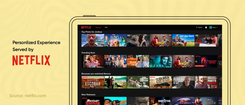
Soon, we will even see hyper-personalized user interfaces that will change the appearance, tone, and position of elements based on individual preferences. You must jump the advanced personalization bandwagon if you want to keep users hooked on your website/app.
21. Super Tech Landing Pages
Another popular UX design trend that’s insanely popular these days is the super tech landing pages. Especially brands like Apple & Microsoft is leveraging them on their tech and product websites to keep customers hooked.
What sets Super Tech landing pages apart is the use of volumetric illustrations, renders, and hyper-realistic complex animations that attract, impress and captivate users. Here’s an example:
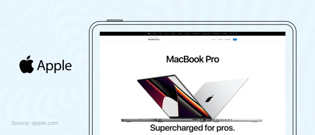
Tech landing pages can be impressive. However, a big challenge is that users can grasp very little information from them. While jaw-dropping visually grabs the focus, they can hardly pay attention to the information presented. So, one thing you should keep in mind while leveraging this UX trend is to find that sweet spot where you can both deliver value and wow users.
22. Physicality & Realistic Textures
Although smooth and cool gradients are mainstream these days, some UX designers are also experimenting with adding realistic experiences to objects with uneven textures.
For example, you can see the graphic below. Don’t the fruits in the crate look almost real? That’s the magic UX designers are creating by using realistic textures.
Here are a few reasons why physicality and realistic textures are getting popular as a UX design trend:
- Physicality and realistic textures make a design feel sincere and authentic.
- As users feel they can almost touch the products, you can evoke a connection between customers and the products you’re selling.
- Such designs feel pleasant to human eyes, and thus consumers are more likely to buy your products.
The only thing you should keep in mind is that you must not overdo it. Otherwise, it will distract the user from the primary goal, i.e., to buy the product.
Conclusion
We made it! It was a sizable list of UI/UX design trends to explore. As we can see, many exciting things will happen in the user experience design sector this year. To prepare ourselves for this evolution, we must first understand these UX design trends. Only after we understand how these trends align with our business needs and the user expectations, we can nail the user experience.
What do you think will be the next big thing in UX in 2024? Please let us know in the comments.

