Usability, findability, and discoverability are the cornerstones of good information architecture (IA) in UX. It defines how you structure, label, design, and organize your information around the digital platforms. The more the focus is on enhancing the information architecture, the better is the customer experience triggered by the UX-design-led-IA.
Findability precedes usability. In the alphabet and on the Web. You can’t use what you can’t find. – Peter Morville
Ever wonder why a beautiful website looks so pleasing and appealing to your eyes? Wonder no more! The end result of any digital offering is due to the art and science of information architecture (IA).
This article will convey everything you need to know about Information architecture and its vital significance along with some examples to help you grasp the big picture.
What is Information Architecture in UX?
In a constantly evolving technical and digital world, it doesn’t matter how innovative a product or solution is if it doesn’t have a User Experience. That’s where information architecture comes into play.
So what exactly is information architecture in UX?
Imagine information architecture as the visual representation of a product’s infrastructure, features and hierarchy, in other words, it’s an all-important blueprint. Information architecture is the specific discipline that focuses on the organization and display of information within digital products.
It deals with structuring, organizing, and labeling information to bring order to the content on websites and products. The goal of incorporating IA is to plan the navigation system to make it easy for people to find and use what they are looking for, i.e., facilitating a user-centered design.
Information architecture in UX covers four essential aspects, i.e.,
- Organization of System: This helps distribute the information in the form of distinguishable categories that make the website or product easy to use.
- Labeling: Helps distinguish information with intuitive labels that depict the meaning or the intent of a button, an option, or a feature.
- Navigation: Aims at making it intuitive and easy for users to jump from one page to the other while trying to complete the intended action
- Search: Helps promote findability and discoverability, i.e., making it easy for users to locate known as well as unknown features and functionalities.
Information architecture, user interface, and user experience are interrelated and share a common objective — offering a delightful customer experience.
Why is Information Architecture Important?
Information architecture is all about organizing digital content in a way that it can be easily understood by its intended target. Often, the intended target may not be technically savvy, therefore the world of information architecture focuses on user experience (UX).
In terms of digital design, information architecture organizes the content of your apps, software, or website in a manner so that the users can understand and find the content they need and also help them to know where they are currently while using the service.
This process needs to be both effective and efficient time-wise because we all know consumers lose patience very quickly especially with digital products.
Information architecture involves dividing large chunks of data into small pieces, labeling them and organizing them in a way so that the information can be found easily and can be effective to use.
For instance, when designers create apps and websites, they lay out each specific screen so that the consumer can quickly and easily find the data they need. Designers also create a flow that allows consumers to navigate between screens effortlessly.
Here are some benefits that your business will witness once you ensure that information architecture has been taken care of:
- Good brand impression
- Increase in the number of visitors
- Better click-through rates
- More leads
- Improved conversions, and thus revenues
What is the difference between IA and UX?
Information architects govern the structure of a digital product with a focus on user navigation. UX designers go one step deeper beyond navigation to also factor in user engagement.
As you would expect with technology and innovation in general, meanings of terms or definitions also evolve, but it’s important to understand the difference.
- Information Architects work to create usable content structures out of complex sets of information via user-centered design methods: usability tests, persona research and creation, and user flow diagrams etc. Nevertheless, IA consists of only a small fraction of overall UX.
- Experience designers delve deeper and connect emotionally with the consumer. Fundamentally, UX designers create the frameworks to make things more profound on an emotional level. Carefully considering the emotions of your target market makes all the difference in a highly competitive business marketplace.
What are the Main Components of Information Architecture?
The following three elements need to be in place to reach the best user experience that leads to a satisfactory customer experience:
1. Ontology
This refers to giving labels to the individually identifiable categories, making it easy for the customers to understand what they are looking at.
A suitable information architecture example for Ontology can be yellow bell pepper, and red bell pepper is tagged and labeled for a user to identify them separately in a superstore.
2. Taxonomy
Is a classification technique where “alike” elements are grouped. It is like a hierarchy that further helps in ranking elements.
Taking the example of the supermarket section of the superstore, you can find bell pepper under the “vegetables” section, which is further categorized under the “organic foods” section. Now how and where the bell peppers are placed also defines its taxonomy.
3. Choreography
Refers to the user flow, i.e., the path that the user most expectedly follows to accomplish the intended task. In simpler words, choreography is the blend of ontology (meaning) and taxonomy (categorization) that work together to offer a splendid user experience.
An example could be the ease of movement across the store and the intuitiveness that follows to help find bell peppers. If you master the choreography, the customer experience witnesses a positive impact automatically.
How Information Architecture Works?
Same way as architects plan or design highly complex structures, information architects develop intricate systems to organize, find, display and use information. Picture a construction site with workers trying to build a new house without a plan or blueprint. Absolute chaos right? The same applies to IA; it requires necessary guidance and direction. And this is where the information architecture diagram comes into the picture.
What is an Information Architecture Diagram?
The information architecture diagram is a blueprint of the design structure that can be generated into wireframes and sitemaps of the project. UX designers utilize them as basic tools to start planning the navigation system. Mapping out the IA is a source of inspiration — visualizing and understanding all the different processes involved and picturing how all the different variables can come together.
The information architecture diagram is an integral part of the digital solution development process. Where UX might provide layouts and wireframes, the diagram results in spreadsheets of documented content, and the two can come together to create workable flow diagrams to map out content and the resulting consumer experience.
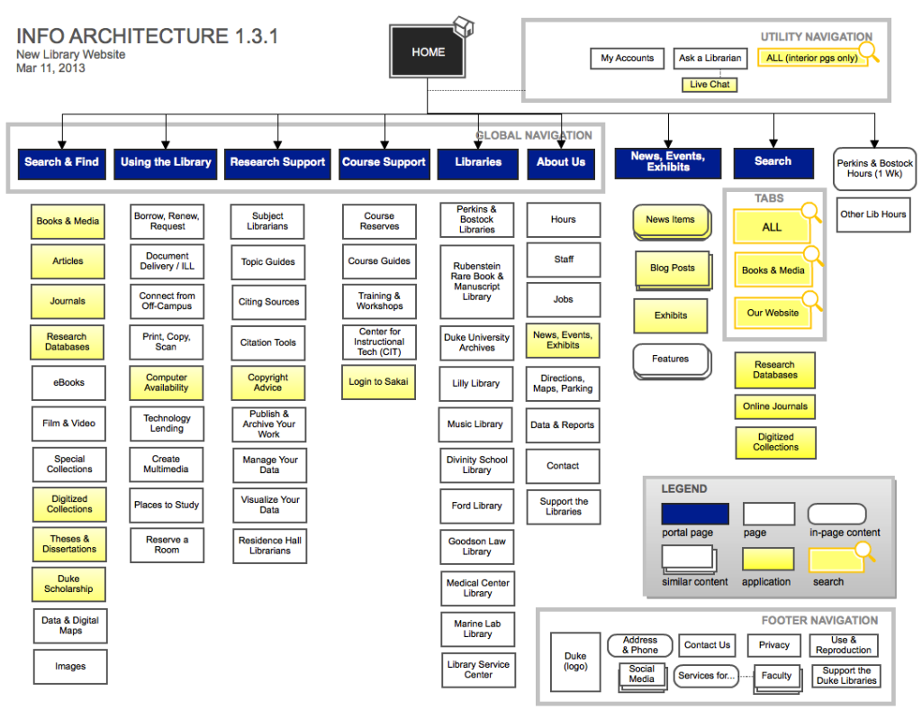
The level of detail is completely up to the designer or teams of designers, but the scope can include navigation, application functions and behaviors, content, and flows etc. In much the same format as sitemaps, designers can create visualizations of the IA and map out what is going to be visible to the user, and what actions will need to be available on the back end. This is the time to see the holistic picture of the solution or website.
Principles of Information Architecture
The following table highlights the eight information architecture principles that should be considered during the design phase:
| 1. Principle of Objects | Every piece of data and information listed on the website or the product has attributes and a specific behavior | |
| 2. Principle of Choices | Do not overwhelm users with multiple choices. Try to avoid the paradox of choice | |
| 3. Principle of Disclosure | Add relevant labels to icons and categories so that the users get an idea of what lies ahead of clicks | |
| 4. Principle of Exemplars | Pop-ups should appear alongside the categories to give users an idea of what it entails. These pop-ups can either contain images or can be text-driven | |
| 5. Principle of Front Doors | This principle implies that every user may have a different entry point to the website. Thus, make your content accessible and welcoming on every page | |
| 6. Principle of Focused Navigation | Ensure that your navigation system is consistent, clean, and intent-driven. None of the elements of the navigation should be counter-intuitive | |
| 7. Principle of Multiple Classifications | Use multiple classification systems to help visitors find what they are looking for. Segregate your buyer personas and see how they browse before finalizing the different classification systems | |
| 8. Principle of Growth | The website or product content is ever-evolving. You need to ensure that your digital platform is scalable, and you have flexible planning around the IA | |
Information Architecture: Best Practices
Here are five best practices to nail product or website information architecture in the right way:
1. User Research & Analysis
Understanding your target audience plays an important role here. To design and develop meaningful information architecture, you need to have a clue around human psychology. How do they use the interface, and what do they expect of the interaction design?
If you understand your user and their mindset, you are already halfway through to provide a great customer experience.
The Card Sorting technique can lend a hand at getting started.
A Short Note on Card Sorting
Card sorting helps design information architecture for websites and products while also lending a hand at analyzing it.
Here the content labels are penned down on cards and provided to the users. In turn, they are told to organize the card structure according to what makes sense to them.
There are two primary types of card sorting methods:
- Open Method: where users work on organizing the categories of the content as well
- Closed Method: where the categories are predefined and users only organize the underlying content
2. Working on Buyer Personas & User Scenarios
This step will help in a better understanding of your users, which, in turn, will help in better information architecture implementation.
At the end of this step, you would be able to make out who your customers are, what they are looking for, and what mindset they follow?
This starts with identifying your buyer personas and their expectations from a web experience similar to yours. You will have to brainstorm around:
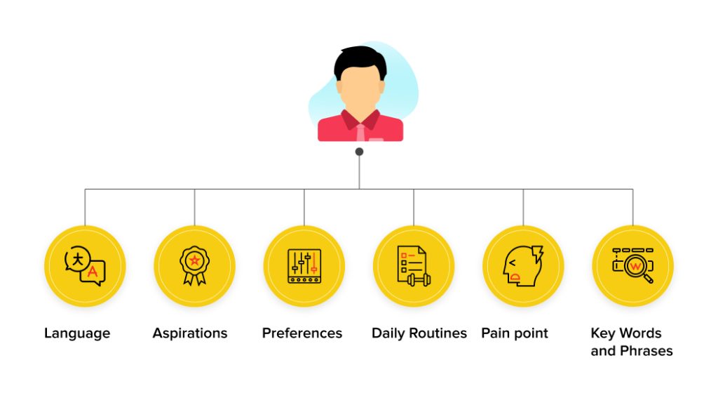
The other part of the story is to connect the buyer personas with the corresponding use cases. A use case is usually a short journey-oriented story of how the user performs a particular task.
For instance, a use case could be to complete a transaction, and the corresponding route or actions that are taken define the particularities of a buyer persona.
By the end of this step, you’ll be able to figure out:
- How do the buyer personas think and act?
- What are the challenges that you would be facing?
- What can be done to overcome the existing challenges?
3. Organization or structure
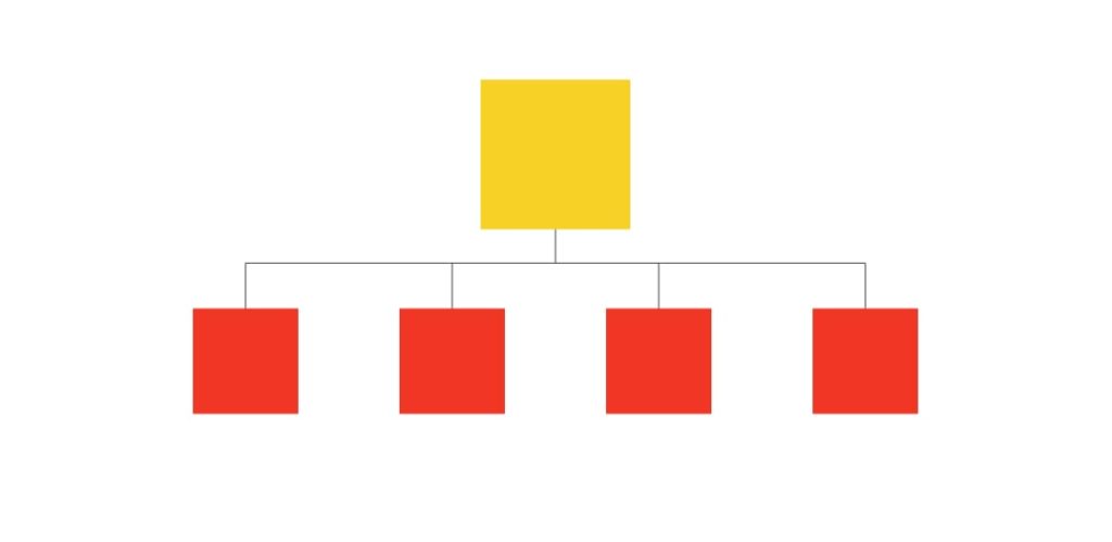
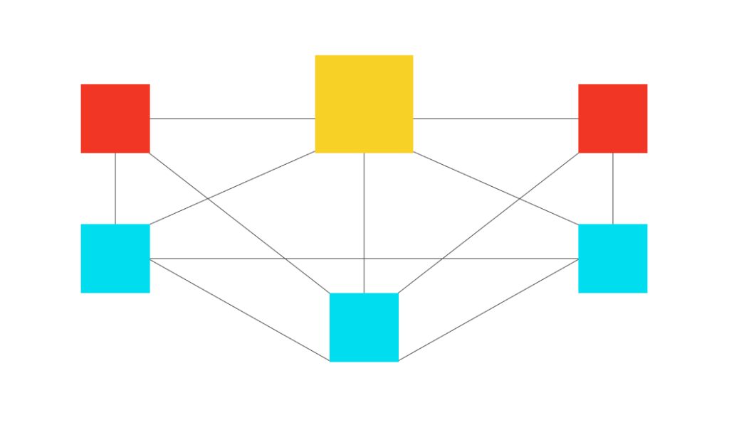
Grouping of information in categories to form a neat and clean structure. There are three types of organizational structures to refer to — hierarchical, sequential, and matrix structure. As you scroll through each of these structures, you’ll have an idea of how to design information architecture.
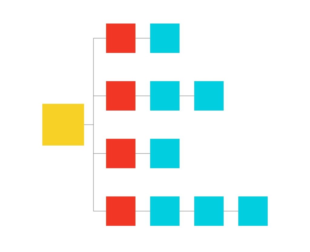
a. Hierarchical Structure
Here, the content is distributed under different categories listed on the page. There is a visible hierarchy that is followed when navigating from one page to another.
b. Sequential
Here, there is a visible path to the steps that should follow. The next steps appear in sequential order on the screen without having to switch between screens.
c. Matrix
Here, the users get to choose how they wish to view the information display on their screens. There are links, buttons, and other elements redirecting to the same information.
It is the users who decide their navigation path.
4. Labeling the System
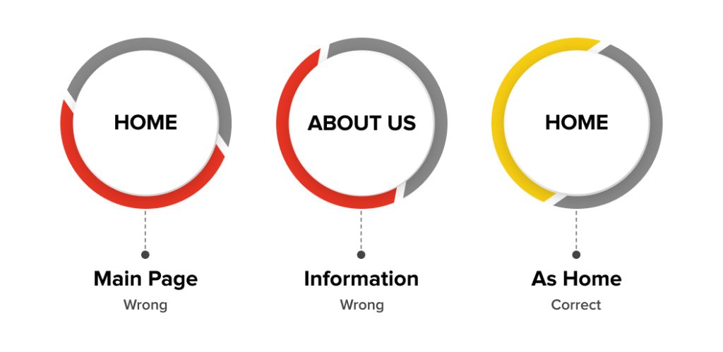
Once the site map that resonates with an ideal hierarchy and navigation are maintained, the next thing on the bucket list is “labeling.” It refers to the act of naming different pages in an intuitive format.
The focus here is to build a human-centered labeling system for the users, and intuitiveness should be prioritized.
For instance, if you label “About Us” as “Information,” — all you are doing is confusing the visitors.
It would help if you cleared the intent, starting with sticking to the traditional practices of naming the different categories and subcategories.
5. Offering an Orchestrated Customer Experience
The last step involves maintaining the flow of information, i.e., making the end-to-end experience worthwhile. It offers a connected and usable experience right from awareness, visiting the website, locating features, and performing the intended action.
The user experience flow should be consistent from entering, finding, locating, using, to performing the intended actions. This will only happen if you plan for information architecture before anything else.
What are the Top 5 Examples of Information Architecture?
1. Sitemaps
Sitemaps are a very important way for a website to communicate with a search engine. Robots (. txt) tells a search engine which part of the website to not include for indexing, and the web sitemap tells these search engines where you’d like them to go.
A sitemap is as crucial to planning a new website as a map is to planning a road trip. Assisting search engines in navigating a website helps bring targeted visitors to websites helping to boost the business bottom line.
2. Content Inventory and Audit
A Content Inventory and Audit is the process of cataloging and analyzing all existing content within a website, application, or system. This involves creating a detailed list of all content items (text, images, videos, documents, etc.) and evaluating their relevance, quality, and performance. The audit helps identify outdated, redundant, or underperforming content, and guides decisions about what to keep, update, or remove. It also helps ensure content is structured in a way that aligns with the user’s needs and business goals. This step is essential for creating a streamlined and organized content strategy.
3. Mapping Out the Information Architecture Diagram
Taking the steps to visualize and understand the information architecture diagram helps direct where the focus should lie. Time is a critical element that should never be wasted. Visualizing and actualizing can go hand in hand with guidance from the information architecture diagram, it pays huge dividends to do it effectively and thoroughly.
4. Labelling
Effective target market segmentation invites sustainable success. Labels play a significant role in whether users are able to find information. For example, a page that contains information about a business of a company is going to be most easily found if it’ll be labeled “Our Service” rather than just “General Information.”
5. Wireframes
Wireframes are vital in combining user research, features, and content into the product itself. That’s why it’s always important to get user feedback in how product prototypes may feel and function. If you draft wireframes prior to going into a prototype, you save valuable time and resources during the project timeline.
5 Top Information Architecture UX Tools
Here is a list of five information architecture tools that can help you get started with website content organization.
1. Dyno Mapper
This amazing visual sitemap generator is excellent to create, customize, edit, and share your interactive sitemaps, but you will also be able to take care of your content inventory, content audit, and keyword tracking. Integrated with Google Analytics, it displays and shares all of the most important data related to your website.
2. Omnigraffle
Create beautiful graphics with this easy-to-use program packed with the power needed to develop robust sitemaps. This information architecture UX tool works only with Macs, and the team behind it fully supports everything that it has to offer.
3. PowerMapper
More than just a site mapping tool, you will be able to map, test, and analyze your website when it is ready. PowerMapper boasts use in over 50 different countries by some of the Fortune 100 organizations, like IBM, NASA, Bank of America, and Boeing.
4. Xtreeme Sitexpert
Create and keep sitemaps that stay up-to-date and are usable across different browsers quickly and easily. This information architecture UX tool offers a plethora of different navigation styles with an abundance of resources.
5. Microsoft Visio
Marketed as a flow chart creator and used by experts worldwide, you have the power to conjure up professional sitemaps utilizing all that this program has to offer. With numerous pre-made templates along with 250,000 shapes included, there’s more than enough to satisfy every need.
Conclusion
Information architecture in UX designing is indeed all about transforming complexity into clarity. You can refer to IA as the foundation of the web and mobile UX design.
Invest in information architects, UX architects, and UX designers who collaborate and often communicate to weave an interconnected customer experience.
In closing, projecting down the road, 90% of the world’s data has been created over the past few years, that trend might only continue to accelerate, the role of IA and UX will continue to develop further and evolve accordingly. Understanding information architecture in UX is critical for business leaders as technology and innovation in general disrupt almost every industry around the globe.

