Having an eCommerce website is no longer an afterthought. It’s necessary if you don’t want the competition to overtake you. Many eCommerce businesses understood this well as the global eCommerce market reached the $5.55 trillion mark this year.
However, having an eCommerce website alone is not enough. It is essential to understand this because brands face steeper competition to capture, convert and retain online shoppers – and only a handful of eCommerce websites get traction.
How do you ensure you don’t end up struggling? Principles like the 15-second rule can give you an initial understanding but can take you only this far. It’s the winning design that will set your eCommerce website apart. Users form opinions in less than 17 microseconds; if that opinion goes in favor, you have your attention.
If you’re seeking inspiration for your eCommerce website design, look no further than this blog. A professional, sleek, and easy-to-use website is essential for any retailer looking to stand out in today’s competitive marketplace. Consider incorporating the latest dashboard UI design trends to create a visually appealing and user-friendly interface for your customers.
What Makes an Excellent eCommerce Website Design?
A ResearchGate study shows that users take only 50 milliseconds to decide whether they want to stay on an eCommerce website or not.
You have less than a second to impress users, and without understanding what makes an eCommerce website design stand, you may not be able to land it. Here are four crucial elements that make a great eCommerce website design:
1. Visual Appeal
Users’ first impression of your website heavily depends on its visuals. Visuals are the first thing they see, and they decide whether to stay or jump the ship based on them. You must focus on creating an immersive visual appeal with high-quality images. It will draw visitors’ attention, evoke interest, and compel them to check out the product for once.
Here’s how you can evoke a great visual appeal on your website:
- Use high-quality graphics. It would be best to use the images captured on a professional camera.
- Include the photos with white background to ensure the customer focuses on the product alone.
- Use lifestyle photos of your products so that customers can envision using them.
- Choose the color and font for your eCommerce website wisely to evoke the proper emotional response.
- Limit yourself to only two colors. Many colors can be tricky and make your website look messy.
- Always keep accessibility in mind. Visitors of all ages and abilities should be able to read and understand it.
2. Smooth Navigation
Sometimes, customers leave a website because its navigation is complex. That’s why smooth navigation is essential on your website. Not only does it ensure customers find what they’re looking for on your eCommerce website, but it also improves its SEO.
To ensure smooth navigation, here are a couple of things you must keep in mind:
- Stick to a few menu headers in your navigation. Also, be straightforward when labeling them.
- Put other menus like return policy and terms of service in the bottom left.
You can always change the headers if you don’t notice enough clicks on them or add on a sub-navigation menu to add further product collections.
3. Responsiveness
A ComScore report shows that visitors spend 70% of digital media time on mobile devices. Digital commerce is the norm now for almost all businesses – despite this, many eCommerce businesses don’t optimize their website for mobile and miss out on a significant number of new sales.
Responsiveness should be your top priority if you don’t want to miss out on sales. Ensure your eCommerce website is user-friendly on different devices, operating systems, and screen sizes.
While choosing a theme based on mobile optimization, personally test it for ease of use. If you’re unhappy with it, your customers won’t be satisfied. Keep testing until you find the right match.
4. Trust
Visual appeal, responsiveness, and smooth navigation can keep visitors hooked, but they won’t buy from you unless you establish trust. They must be assured that the product you deliver will be as you have displayed on the website.
Here are three indicators you can use on your website to establish trust with your customers:
- Contact Information to ensure customers know they’re buying from an actual entity.
- A return policy so that customers can return products easier if they’re not satisfied.
- Technical certifications to show customers that you have the expertise to deliver their products safely and protect their information.
11 Winning eCommerce Website Design Examples
Here are 11 popular eCommerce website designs for 2024 that you can consider if you’re looking for a bit of inspiration for building your online store:
1. Amazon
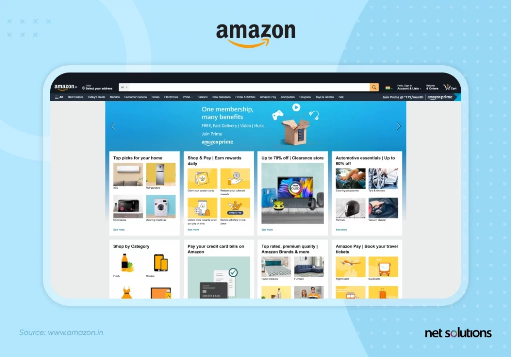
With over 224 million unique monthly US visitors and 163.5 million Amazon Prime members, Amazon is the success story every eCommerce website aspires to be. They started by selling books, but today they boast an impressive catalog of over 12 million products supported by 9.7 million sellers. (Marketplace pulse)
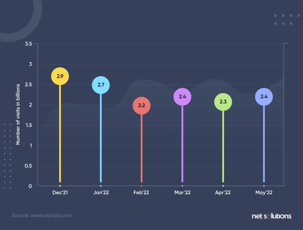
But what led Amazon to rise above being an online bookstore and become one of the most popular eCommerce websites in the US? Its immersive and highly personalized website design.
Amazon focuses on user experience with a minimal, search-oriented user interface coupled with curated lists and shopping personalization. It also boasts a robust search algorithm that includes auto-complete prompts, automatically ordering results based on featured products or bestsellers (boosting word-of-mouth marketing), and robust filtering.
The eCommerce website also offers personalizations that target results based on location and shopping history. These real-time personalized recommendations from the homepage to search results to a user’s shopping cart raise the number of customers and the overall value of purchases. Besides, product reviews and ratings help validate the purchase quality by providing testimonials from real users.
Overall, Amazon makes users feel special throughout their journey, and it ensures that people leave satisfied and visit again for more.
2. Google Store
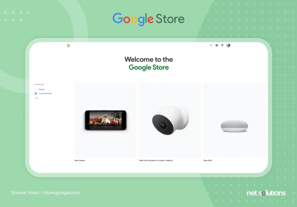
The Google store is renowned for its Next, Chromecast, and Pixer product lineup. Especially its Pixel smartphones are the 5th most popular in the US, with 380% YoY growth(Canalys). The entire Google Store differentiates itself from its primary competitor Apple by offering a more subdued, clean, and uncluttered appearance.
But why is the Google store so popular? Because it features clear product information and comparison charts coupled with solid graphics, movement, and expanding elements. For most eCommerce sites, the unusual scrolling behaviors would detract from the shopping experience, but for Google, the performance, style, and functionality become inherent brand attributes.
3. Dollar Shave Club
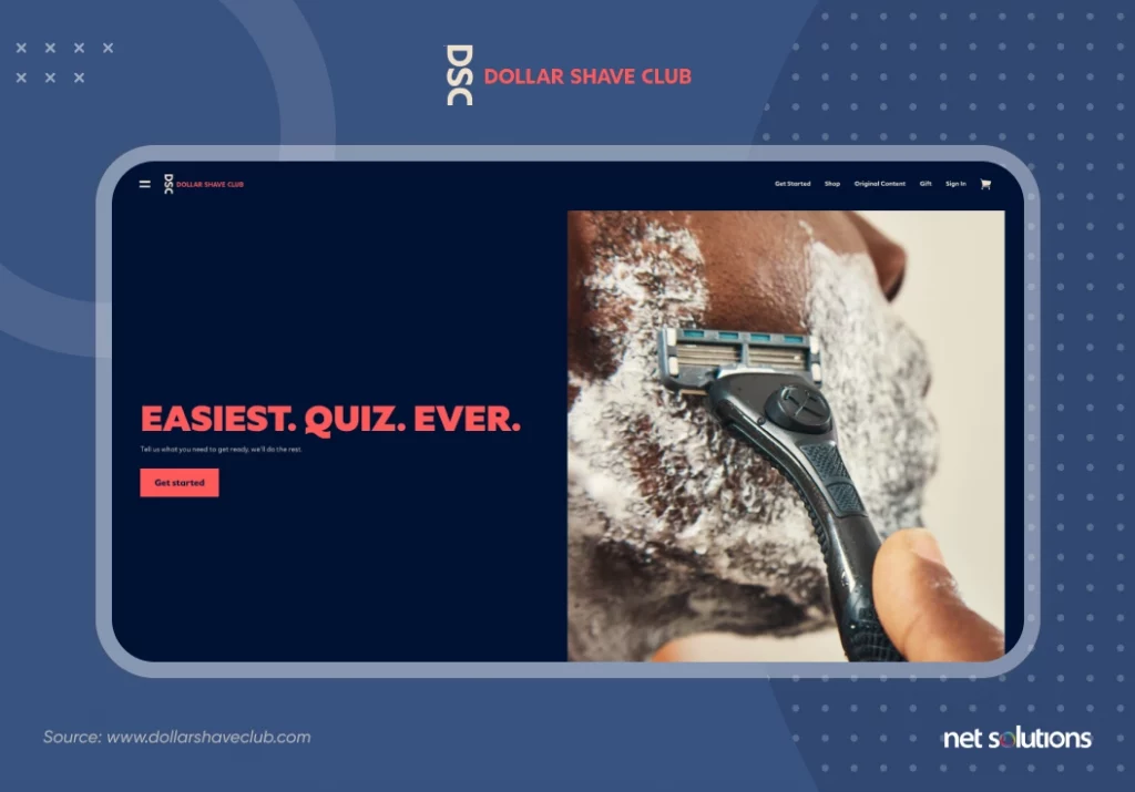
Dollar Shave Club started by delivering high-quality razors at affordable prices monthly. Today, it is a prominent supplier of personal grooming products – catering to around 4 million subscribers.
But the journey was never easy for Dollar Shaving club. There was a time when it was a dwindling eCommerce startup, and the company had to reinvent its eCommerce presence to remain relevant.
The new eCommerce website of Dollar Shaving club features a wider variety of models representing a more excellent range of consumers, and the shop has expanded its product lineup. Although Dollar Shave Club offers products individually, the website’s carefully-crafted calls to action and user quiz provide new customers a subscription as their initial prompt to buy.
Following clean design trends and building trust through content, Dollar Shave Club has elevated its product descriptions by adding product benefits, ingredients, usage tips, and helpful how-to photos to each listing.
4. Etsy
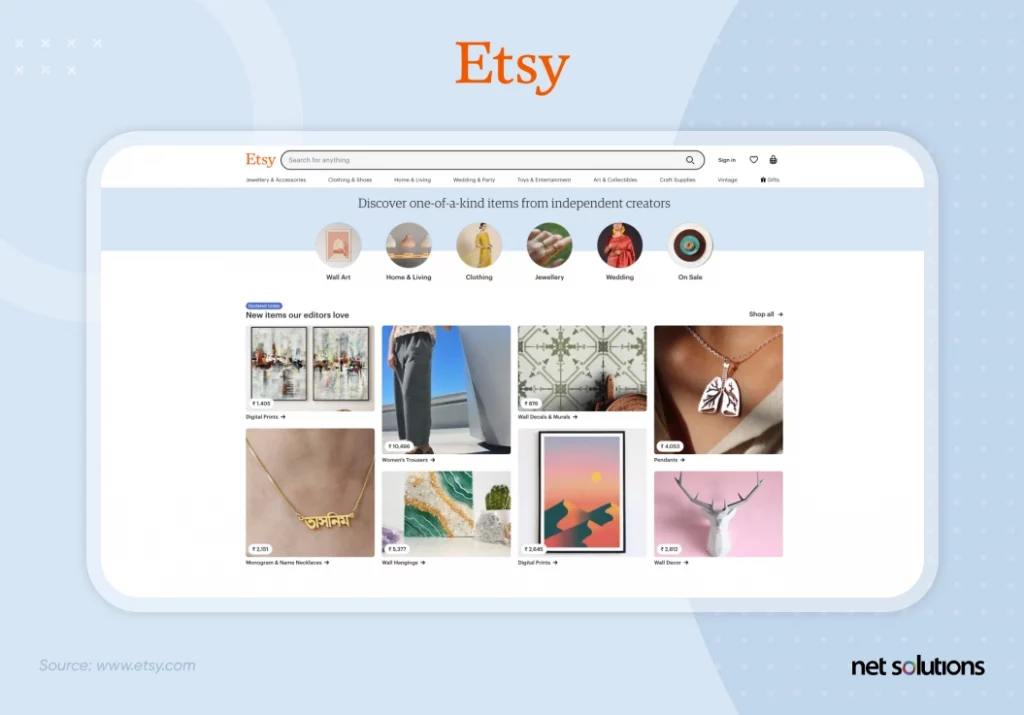
According to Statista reports:
- Etsy has over 7.5 million active sellers.
- Focusing on handmade and vintage items, Etsy has sold more than $13.5 billion in 2021, becoming the most successful consumer-to-consumer (C2C) eCommerce platform.
Etsy is popular because it follows the minimalism trend in web design, evolving its design to focus on search and personalized recommendations. Also, Etsy is strongly skewed toward mobile users, representing 64% of gross sales, and is firmly integrated with social media (Pinterest). Its search results focus on key elements of the sale process, highlighting prices and discounts, bestseller status, free delivery options, star ratings, and the option to save (“heart”) an item.
Unlike other eCommerce sites, Etsy features higher reviews on the product page and includes clear delivery information to your location. Etsy has done an excellent job mimicking the in-person shopping experience by encouraging users to message the seller and curating additional recommendations by the same seller or in the same space.
5. Canva
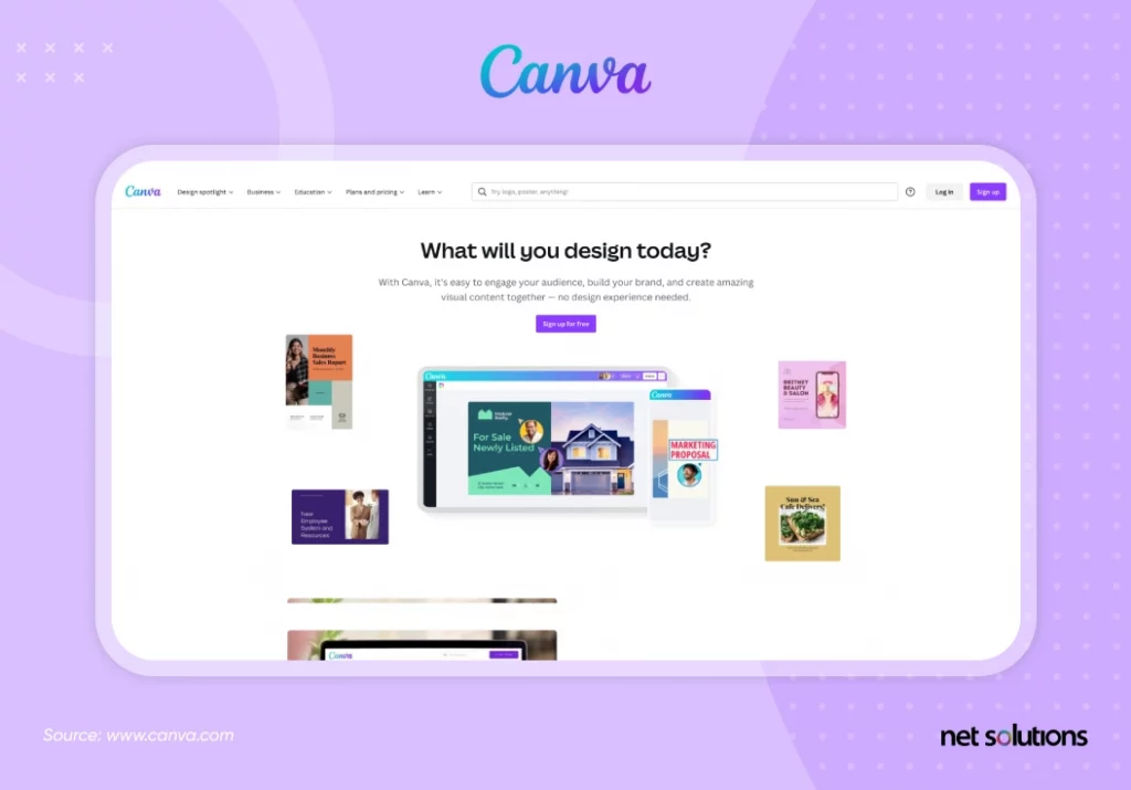
As of 2022, Canva has 75 million active users in 179 countries. With the philosophy that “design is for everybody,” the do-it-yourself design platform has given many people the confidence to create something beautiful.
The core selling point of Canva is usability. With its easy-to-use interface, anyone with basic knowledge can use it to design graphics, and if they want more – they can upgrade to the premium version.
“We needed to change their self-belief about their design abilities, we needed to give them design needs, and we needed to make them feel happy and confident clicking around. We needed to get them to explore and play in Canva. No short order! So we spent months perfecting the onboarding experience paying particular attention to users’ emotional journey.”– Melanie Perkins, Canva CEO and Co-Founder
By making users feel good about their experience on Canva, the site has consistently managed to convert designers into buyers, leading to a $40 billion valuation. Similar to in-app purchases, Canva offers in-experience investments to improve designs for free users and add features and images for paid users.
6. Flamingo Estate
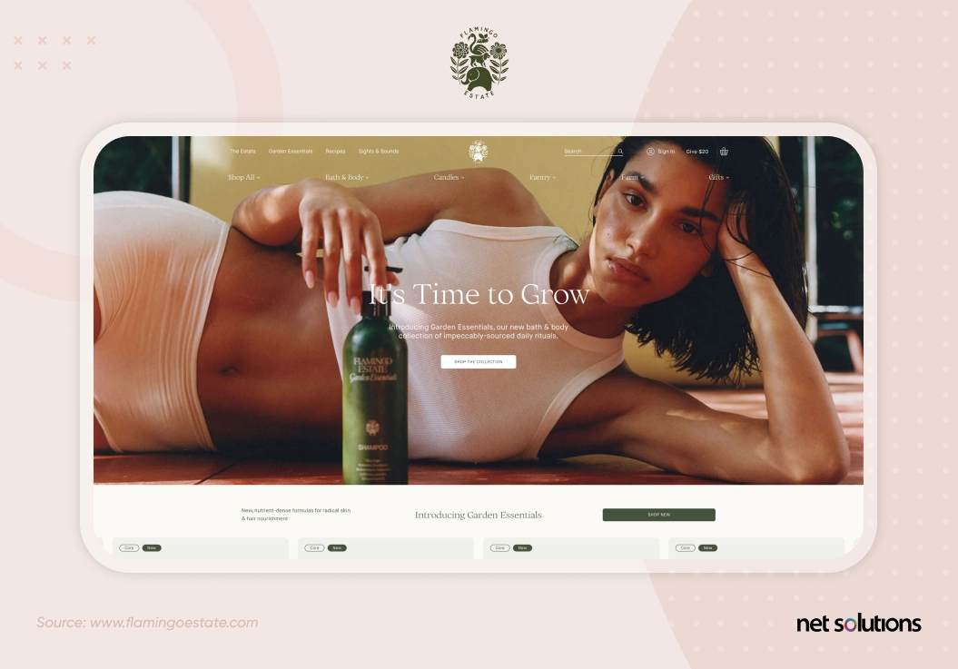 If white space is the epitome of clean, simple UX, then how does a brand manage to convey the sense of “clean” with a full-page video? Flamingo Estate is about curating an image: about what you get and who you become when you buy nature-inspired products, including produce, pantry staples, and bathing products. The focus on nature, clean font, and widely spaced navigation provide the same sense of a clean aesthetic as we would typically associate with white space.
Although small, there is no shortage of beauty from Flamingo Estate and the bounty of products created in its biodynamic botanical gardens. The eCommerce site reflects the brand’s exclusivity, supported by influencer marketing and prominent designers.
Throughout the site, product images are simple, stark, and beautifully displayed with a warmth introduced by choices of colors and fonts. The brand is further supported by prominent influencer marketing and designer touches.
Despite its small size, Flamingo Estate is curating loyalty by offering products as one-time purchases and through subscribe & save plans.
7. Euro Car Parts
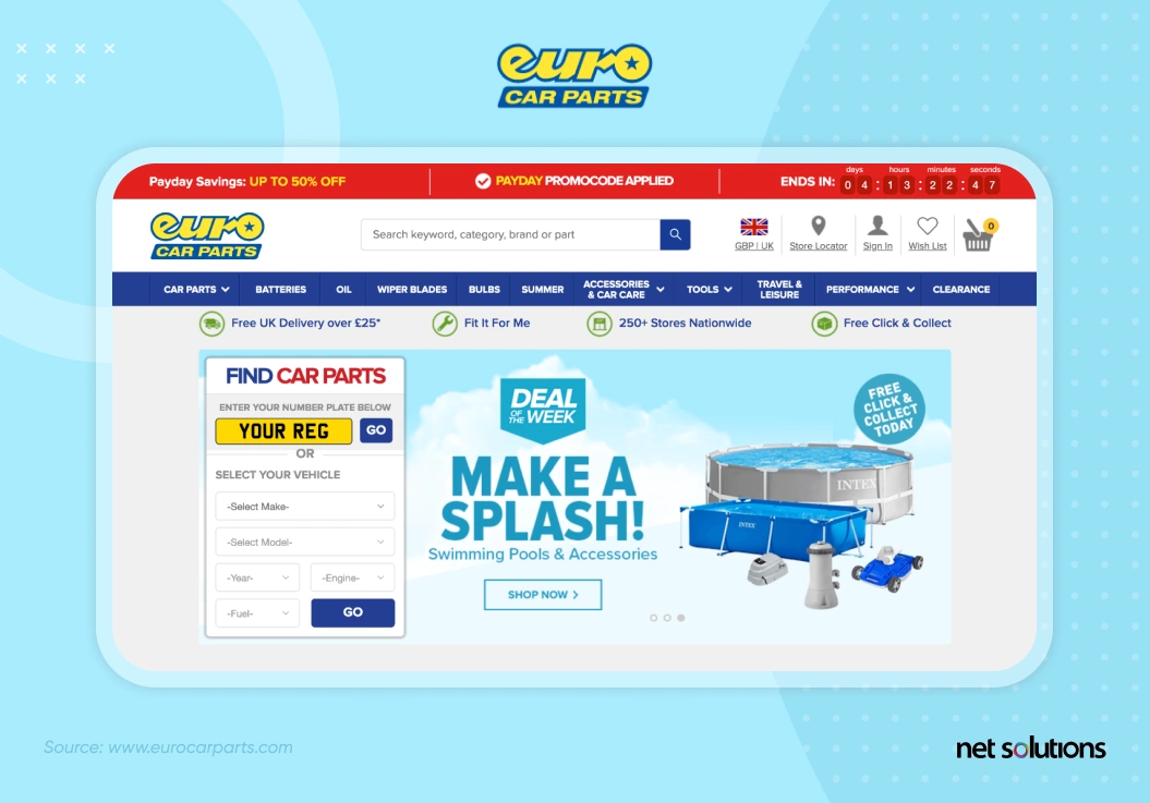 A Fortune 500 company, Euro Cart Parts is the UK’s largest supplier of essential components and consumables for more than 4,000 vehicles. Euro Car Parts brings in more than 3x the revenue of their closest competitor, a testament to an aggressive business plan that extended to eCommerce. Today, Euro Car Parts earns over 1.6 Billion in revenue, a figure which continues to grow month over month.
The Euro Car Parts eCommerce website is the primary reason behind its soaring popularity. It boasts a high conversion rate thanks to a rapid page load speed, simple UX, and fast internal search functionality that includes filters to narrow down the search and personalize the product listing to increase the chance of a sale.

Here’s how we helped our client ECP maximize its relevance and scale by leveraging personalization.
8. Simply Gum
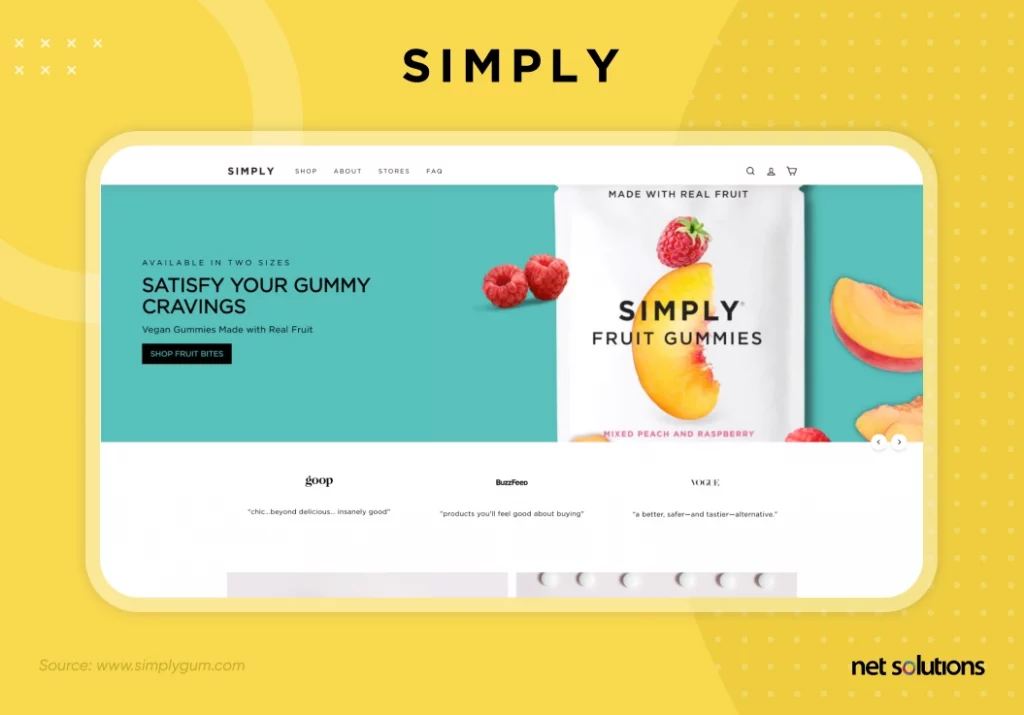
Simply Gum is another prominent example of an eCommerce startup that emerged from a brilliant idea and became a household name. Earning $5 million in revenue showed the world that a great eCommerce website design can accelerate gum sales.
The SimplyGum.com website mirrors the aesthetics of the Gum and its packing. Not only does it differentiate itself with clear visuals, but it also keeps customers coming for more with subscription offerings. The enterprise also establishes trust by showcasing how Simply Gum is healthier with detailed infographics.
Simply Gum also allows customers to buy candy bars and fruit gummies easily. They have even expanded into gift boxes and assorted packs, leading to more sales and a loyal customer base.
9. Smash + Tess
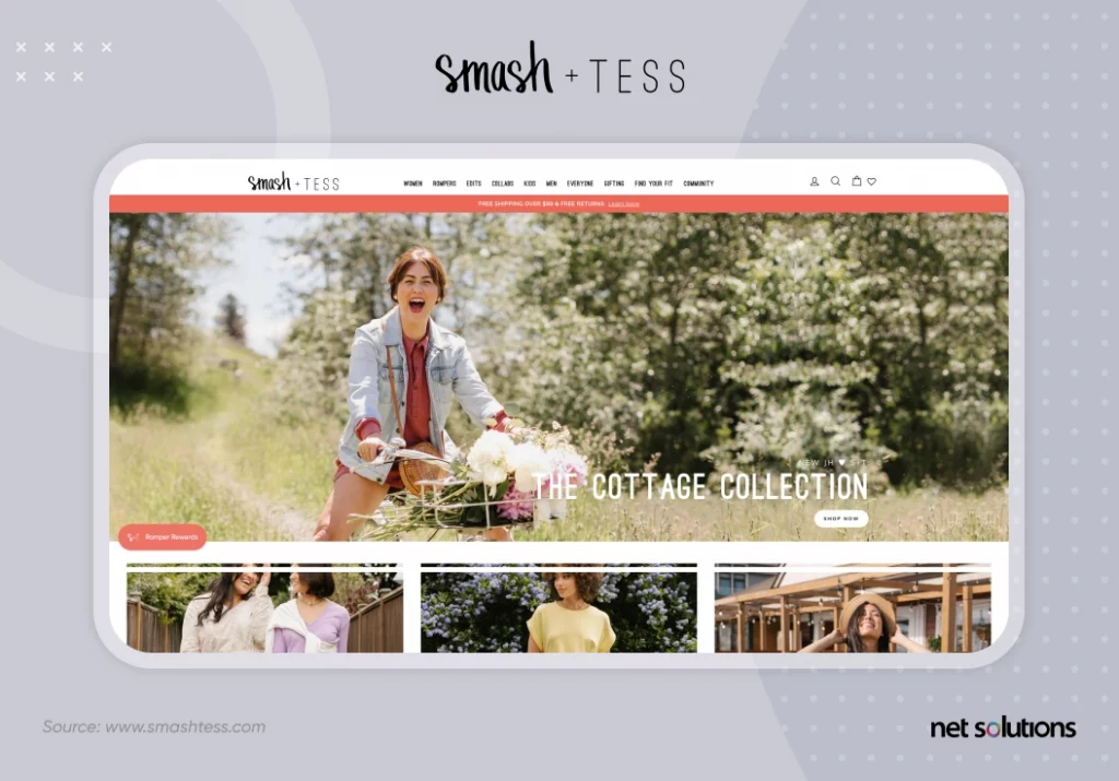
It’s the romper revolution we never saw coming. Canadian brand Smash + Tess has created a new style category by elevating the casual romper into a wardrobe staple for the house, grocery store, or runway. The startup catapulted to success through word of mouth, including social media sales and influencer marketing, turning its biggest fans into co-designers and amplifying brand reach.
Smash + Tess has handled its explosive growth with creative eCommerce development solutions, including launch wait lists, re-launch promotions, rewards, and a focus on social proof through ratings and integrated Instagram feature images.
10. Skullcandy
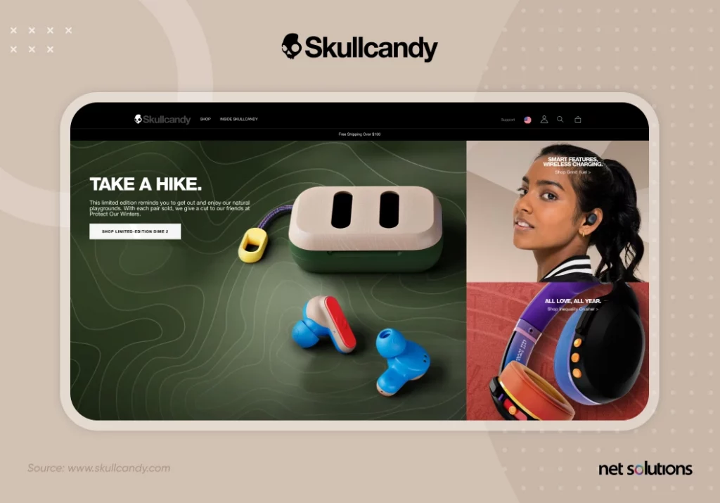
Skullcandy is another prominent example of an eCommerce brand that’s a household name among music lovers, and the credit goes to the premium quality earphones and official website. It uses colors effectively and strikes the right balance between text and visuals. Skullcandy also uses high-quality product photography to convey to its customers that it cares about quality.
Overall, the website is immersive and offers a seamless experience by keeping visitors engaged at each step of their journey.
11. Premium Teas
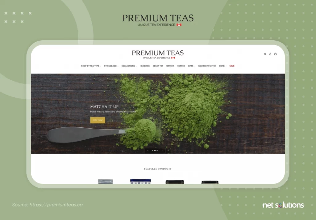
The principle of “less is more” does wonders in eCommerce web design, and Premium Teas understands this well. That’s why they have a sophisticated website design that is clean, modern, and uncluttered.
Visitors can quickly scroll through the collection of teas, and if they need more information about a product, they can click on it to redirect to a detailed product description.
Build Best Designed eCommerce Website with Net Solutions
When building an eCommerce website, there are many factors to consider. As a User Experience Company, we understand the importance of creating a seamless customer journey. That’s why we recommend incorporating design operations into your planning and strategy. You can ensure a successful online presence by considering audience preferences and staying on top of trends.
At Net Solutions, we can take all the load off your shoulders. With us, you don’t have to worry about anything. We take care of your needs & design a personalized user experience that nurtures brand loyalty. We have already done it for brands like Euro Car Parts. Now, it’s your turn. Contact us!
Frequently Asked Questions
Five design patterns are popular in eCommerce websites:
- Flexible sign-in: Always keep sign-in optional unless the user needs to checkout with products.
- Search by text, image, voice, or barcode: It is essential as the digital landscape is evolving.
- Browse by product categories: It ensures users get what they’re looking for in an organized manner.
- Card variety and consistency: Since cards are the first things users interact with, these features create a strong impression.
- Different CTAs for different user stages: Different CTAs for different stages ensure you’re not forcefully nagging the person to buy the product.
There are three ways to build an eCommerce website from scratch:
- Code your entire website.
- Use website builder platforms like Shopify or Foursquare.
- Engage a web development company to develop your website.
The number of pages in an eCommerce website entirely depends on how many products and product categories you have. If you offer ten types of products, you’ll have a minimum of 12 Category pages and a separate Product Detail page for every offer.


