Summary: UX Design is how you apply powerful storytelling to design a memorable product experience for your users. This 8-step UX design process will help you gain insight into a better design and improve your UX practices.
UX design has made considerable progress recently, but the discipline is still finding its feet in the ever-changing digital environment. For every new UX design trend that vows to change the way we look at design experiences, there is still tons of work to be done on understanding the UX design process to serve the target audience better.
The UX design process starts with understanding the customer’s expectations. By grasping the psychology of a user and applying UX design best practices, it’s possible to furnish them with a positive and essential experience.
This article discusses what UX design (UXD) is and shares a step-by-step guide on the UX design process to create a great user experience.
We respect your privacy. Your information is safe.
What is UX Design?
User Experience Design (UXD or UED) enhances user satisfaction with a product by improving the usability, accessibility, and pleasure of interacting with the product.
Building a user experience to the level of customer satisfaction is not an individual’s or a team’s responsibility; instead, it is an organization’s vision.
Great user experience design not just features and promotes your digital space; it also plays a vital role in developing customer confidence. Combining great user experience design, content, and the potential to solve customers’ problems helps in desired brand positioning.
How can UX Design help improve your business?
The value of UX design is directly reflected in key business metrics. Creating products that offer customers meaningful and pertinent experiences is the goal of user experience (UX) design, and UX designers approach the development of a product or service strategically. Keeping the customer journey in mind, they prioritize user experience across the entire decision-making process, focusing more on the product or service’s capabilities than its aesthetic appeal.
We now understand that the digital revolution is intricately linked to many facets of our world. And to create the complete consumer experience, various experiences—from human to digital to physical—must flourish effortlessly together. UX design is one of the crucial stages of product development; how does it impact your business? Let’s see.
1. Improves user engagement
A good UX design will help you get new customers. It will improve your customer acquisition rate and also help in retaining them. This brings a strong and valuable competitive advantage in building a loyal user base. You only have 3 seconds to hook your customers. Make the best out of it.
2. Increases conversion rate
When you design keeping your target audience in mind – you design for them. This is important in helping you understand your target market and help boost your conversion rate. A good and simple design will always help your customers navigate your website/app. Make sure you’re putting the right resources in the right places.
3. Reduces bounce rate
When your website or app satisfies your user’s needs, it’ll automatically stay. People hate using apps that have bugs and are confusing to navigate. Ensure your typography, font style, button placement, and color schemes don’t confuse your customers and obstruct their decision-making process.
What is the UX Design Process?
When a customer goes to the designer with a problem, the majority of the designers hop directly onto a solution, which isn’t the correct way. You must put yourself in your customers’ shoes to understand their problems first.
Solving problems the UX way looks like this:
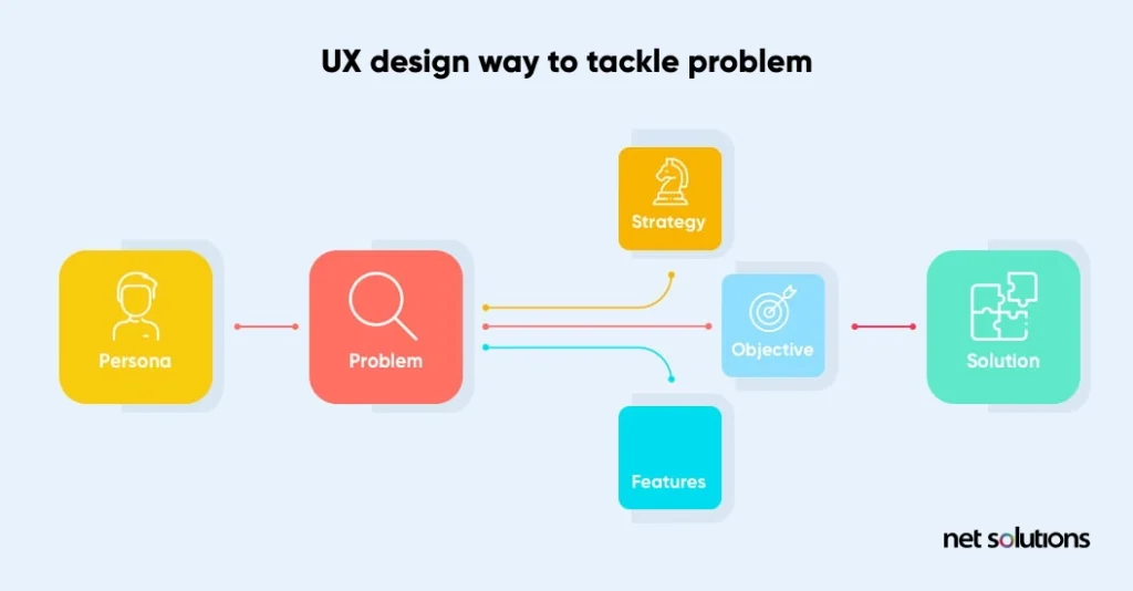
Smart user experience design starts by distinguishing the problem and managing all ideas to tackle the problem. Before addressing the problem, try to resolve these queries:
What are the 8 Stages of the UX Design Process?
The UX design process involves finding a product’s why, what, and how. While the “Why” involves finding the user’s motivation or reasons behind using a product, the “What” addresses the actions users can take using a product (the product’s functionality). And the “How” relates to the creation of the functionality seamlessly.
Whether it be a website or mobile app, all successful products require a seamless UX. Hooking a user with a brand is crucial as its absence can frustrate users, resulting in poor user retention. Here is what a UX design process diagram looks like:
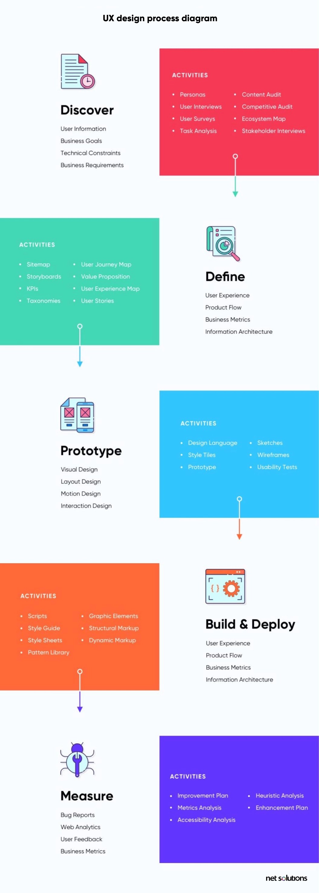
Let’s divide these phases into 8 steps of the UX design process to understand what it looks like and how you can design amazing user experiences.
1. Stakeholder Interviews

Conducting stakeholder interviews is the first step of the design process. They assist you with understanding user behavior, distinguishing constraints, and identifying pain points.
“A problem well stated is a problem half solved.”– Charles Kettering.
It helps you guide the flow of the entire project, such as business goals, technical constraints, usability problems, and what customers expect from a final product or service.
Stakeholders are those people whose feedback and approval are required throughout the UX design phase. Stakeholders are behind the concept of a software product or a website, so it’s critical to understand the final product that they have envisioned.
Here are some tips on conducting a successful stakeholder interview:
- Identify all key stakeholders whose feedback and approvals are required to streamline the user flow activities
- Try to conduct a one-on-one interview with each stakeholder to uncover unexpected viewpoints concerning user interface and user experience
- Record stakeholder interview as-is, and don’t rephrase their answers, as it may distort the actual message
- Compile the insights of individual stakeholders into one document and distribute it to all stakeholders for review and comments
Stakeholder interviews offer rich insights and help UX designers to get the focus right. The best thing to do is to keep the designers, developers and user experience design agency actively involved in the process. In this way, they get a clear picture of the goal of a product.
2. User Research

Acing the UI UX design process implies continually thinking from the users’ perspective. Knowing their viewpoint can only come through working with real users while doing in-depth user research.
User research is the first step of a UX design process. It encourages us to discover precisely how our target customers feel while collaborating with the product designed to meet their objectives.
User research methods are often conducted simultaneously with stakeholder interviews, and there’s not much difference between the expected outcome of stakeholder interviews and user research. While stakeholder interviews give us insights into the business goal of a product, user research tells us what features users expect from the product.
To get into the end-users mindset, you need to understand the two essential facets of user research:
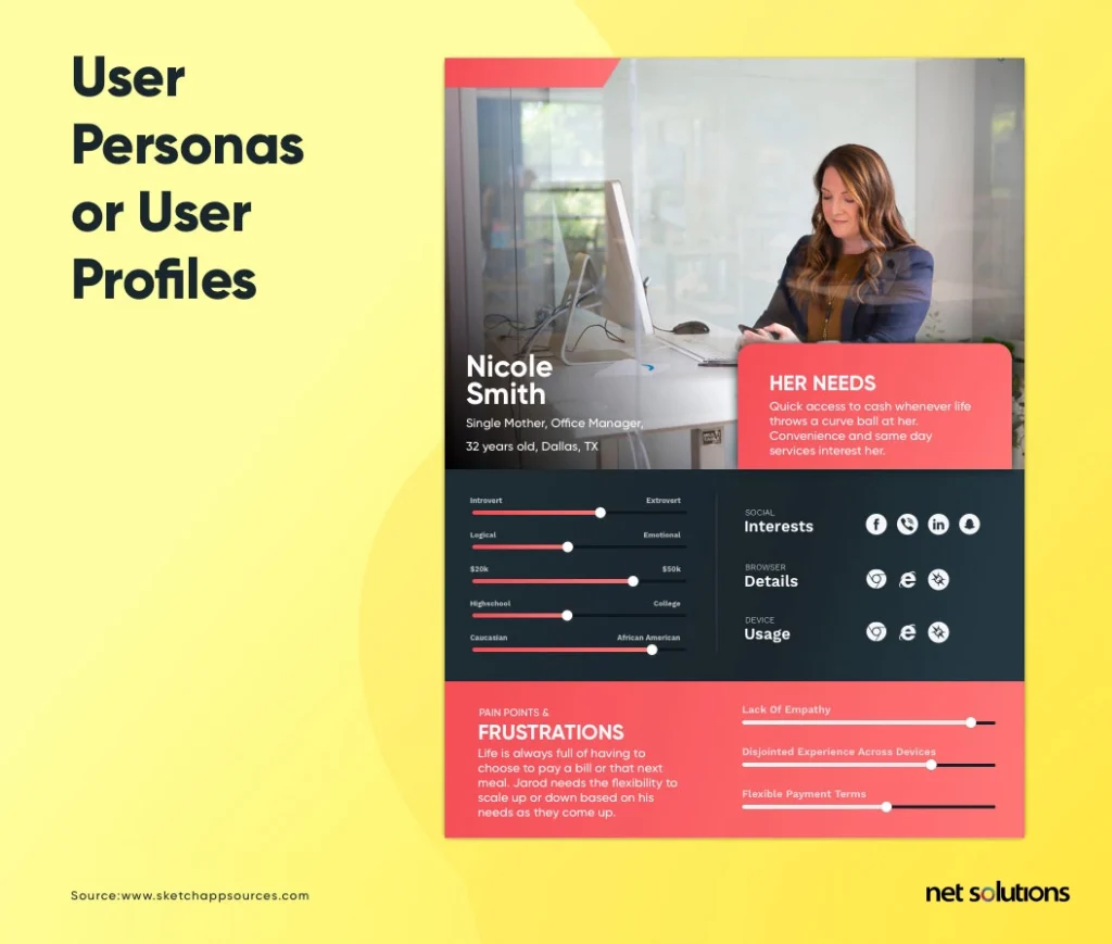
a. User Personas or User Profiles
Creating user profiles or user personas is one of the most essential user experience design steps. A user persona is usually based on two dimensions – demographic and psychographic. Age, gender, education level, income group, culture, etc., fall under demographic aspects.
On the other hand, psychographic dimensions cover the behavioral aspects of a user, such as likes and dislikes.
Here is an example of a user persona:
b. User Journeys
User journeys describe the different paths users follow to complete a specific task within a system, a website, or an application. In the case of an existing app or website, user journeys show the current user workflow and help us find areas of improvement for a better workflow.
User journeys are a part of the digital product design process that helps understand the application from a user’s point of view. It gives you valuable insights into creating the flow of activities from one end to the other so that everything falls in the right place and users can complete tasks effortlessly.
3. UX Audit
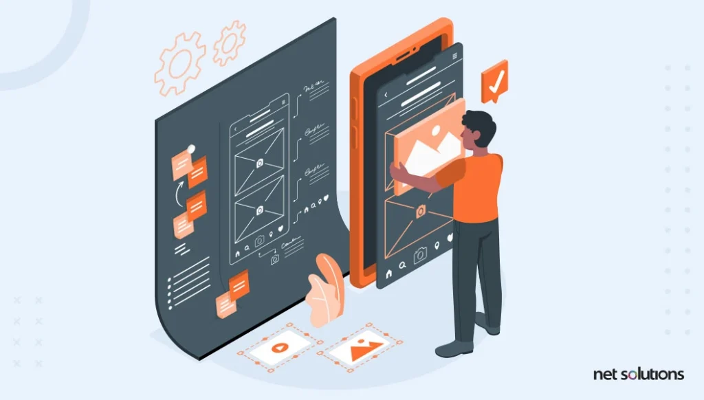
A User Experience Audit (UX Audit) is a way to pinpoint less-than-perfect areas of a digital product. This is one of the most essential UX design process steps that help reveal which parts of a website or app are causing headaches for users and stymieing conversions. As with financial audits, a UX audit uses empirical methods to expand an existing situation and offer heuristics-based recommendations for improvements or user-centric enhancements.
Ultimately, a UX audit should let you know how to boost conversions by making it easier for users to achieve their goals on your site or software. Though a website audit includes a vast list of elements to verify based on your app’s specific needs, here is a list of some critical areas that shouldn’t be left out.
Key user-specific activities should be easily located in the app or a website, e.g., objects, actions, options, and menu items. Also, ensure that the main navigation is easily identifiable and that navigation labels are clear and concise.
- The system should always keep users informed about what’s going on at the backend.
- The app or website should use non-technical and day-to-day terms familiar to end-users.
- It should be clear whether different words, situations, or actions mean the same thing.
- Error messages should be expressed in everyday language, and they should also offer a solution.
- Make sure the help information is easily accessible, well-organized, and relevant.
- Page or application load time should be reasonable.
- Font types and text formatting should be conducive to easy readability.
- The homepage should be easily digestible in 5 seconds. If users take longer to understand what the page is all about, they’ll probably leave the page sooner.
4. Gathering Requirements

Gathering requirements is one of the vital UX process steps. Getting it wrong from the get-go can devastatingly affect how the final project outcome turns out. It is a standalone software development life cycle (SDLC) process. It takes lots of research, an intensive understanding of what kind of project you’re setting out on, and a handful of patience.
Here are the six things you must consider to make user experience design better and faster.
- Brainstorming and ideation session among teams and clients
- Stakeholder interviews
- User Interviews
- Create a low-fidelity prototype or sketch
- User scenarios, stories, and personas
- Documentation
Remember that the requirements are based on insights gathered from stakeholder and user interviews, so it’s essential to do the first three steps right to create an accurate requirements definition document.
The entire UX design process activities are done per the requirements mentioned in this document; therefore, they should be described meticulously to keep the project on the right track.
5. Information Architecture/Wireframes
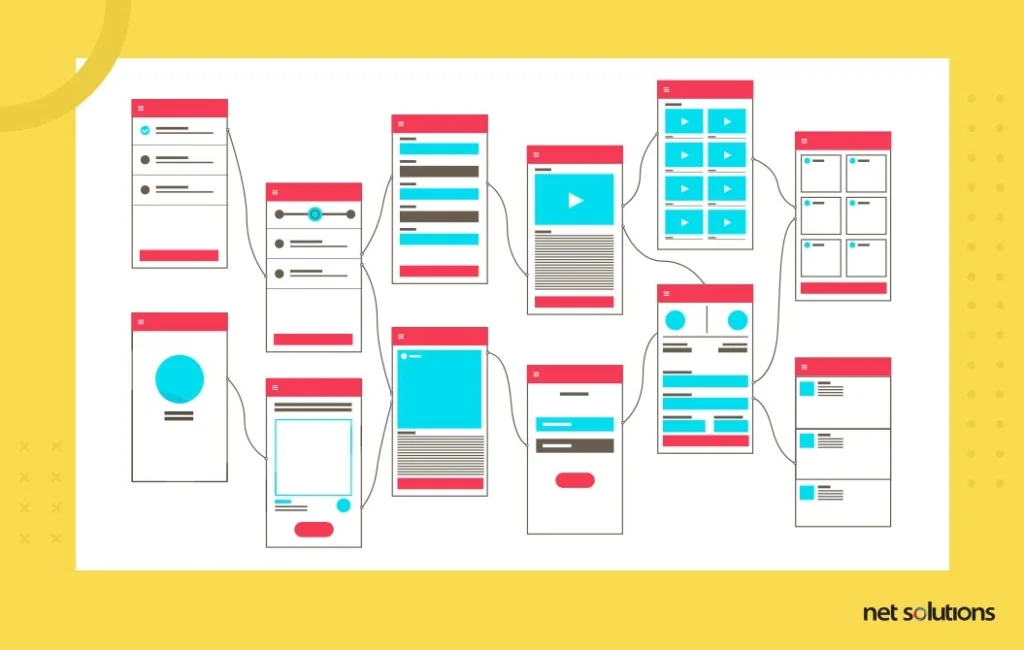
Information architecture (IA) and wireframes are all about organizing the content and flow of a website or an application so that users can quickly complete their tasks and achieve their goals. The focus is on creating usable content structures out of complex sets of information.
A wireframe is the skeleton of a web page or an application. It shows the order of various elements on the screen and how they fit into the overall structure of a website.
The following are the steps involved in developing the information architecture of a website:
a. Content Organization
Organization of content is the first step in the IA process, which deals with formally classifying content based on how the users of a particular domain might access it at various levels. However, developing a thorough understanding of content is critical before organizing it.
Techniques such as card sorting can be used here, where all navigation labels of the website are written on different cards, and users are asked to place these cards in a way they want the information to be organized.
b. Information Relationships
Creating information relationships is all about making the information usable. For example, in an online bookstore, people might only sometimes remember a book they want to purchase by its title.
Therefore, it’s essential to connect various metadata elements to a particular book, such as author, publisher, year of publishing, awards, etc., so that users can find a book title by its author name, and so on.
c. Creating Navigation
The next step is to provide a navigation structure for the organized content. This is where sitemaps and wireframes come into play. While sitemaps display page relationships and paths, wireframes display page-level content organization.
Wireframes combine all three information architecture elements – content organization, information relationships, and navigation system – and present them through a basic structure.
Before you start working on wireframes, choose the appropriate fidelity of wireframes:
- Low Fidelity: Low-fidelity wireframes are usually created during the initial stages of the UX design process. Paper sketching is the low-fidelity approach to wireframing and is specifically useful during the brainstorming and conceptualizing phase.
- Medium Fidelity: Medium fidelity wireframes are more refined versions that show the application’s or a website’s behavioral or minimal functional aspects. These wireframes are more relevant in determining how good the user experience is and whether the user needs will be met.
- High Fidelity: High-fidelity designs are closest to the final product, with various visual elements incorporated in the design, like colors, images, design, and typography. High-fidelity designs can be used for usability testing and serve as an excellent reference for developers to get a good idea of the final product.
6. Visual Designs
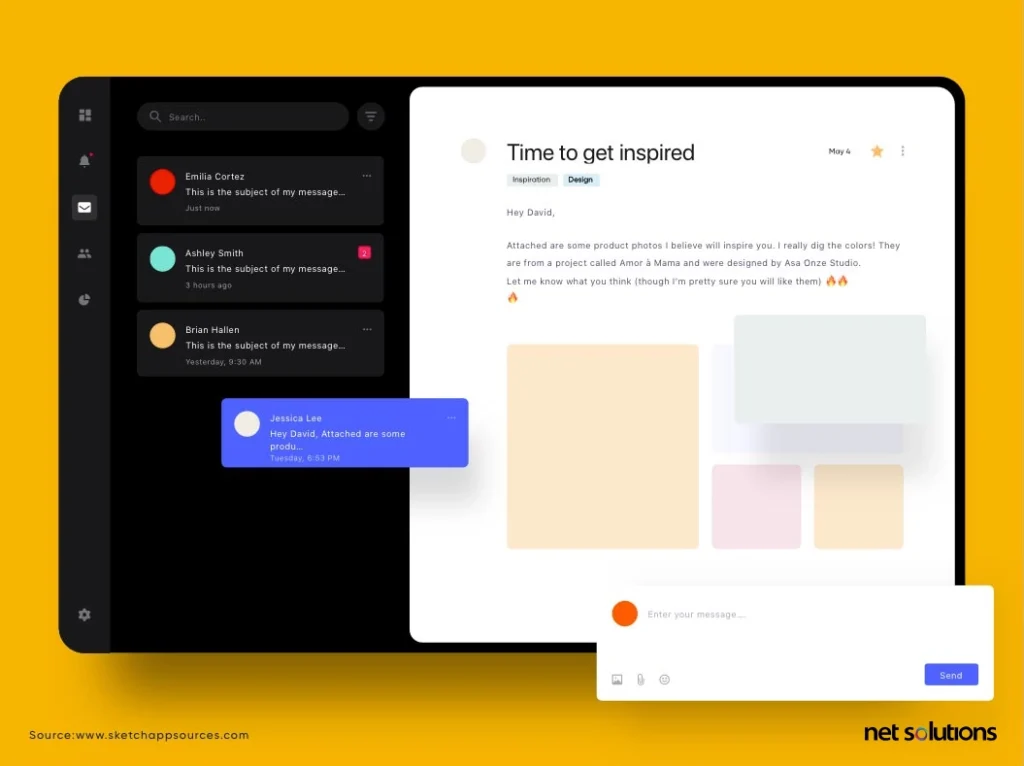
Visual design is an essential experience design method that focuses on the aesthetics of a site or application. But more than the ‘look & feel’ factor, the design is driven primarily by the ‘usability and functionality factor. By usability and functionality, we mean focusing on creating a delightful and useful user experience.
“Design is not just what it looks like and feels like. Design is how it works.”– Steve Jobs
Everybody recognizes Apple products as they have a sleek and unique appearance. The models of iPhones and Macs have inspired tech companies worldwide. In any case, it isn’t the aesthetic of Apple products that brought them universal praise. The user experience and usability of the products differentiated Apple from its competitors. Designing a delightful user experience includes carefully planning a customer journey for the users and helping them find what they are searching for through an intuitive procedure. Especially in the case of user experience design, user-centered visual design is the dominant design approach. That’s why visual design is also called user-centered design within the UX methodology.
Let’s unravel some fundamental principles associated with visual design:
- Visual design is based on an explicit understanding of users, tasks, and environments.
- User-centered evaluations drive the entire user experience design process. Users are involved continuously throughout the visual design process to get feedback, make changes, and even redesign.
- Visual design cannot be done in isolation since it addresses the whole user experience. Eventually, the design should support all the elements of UX design.
7. Prototypes
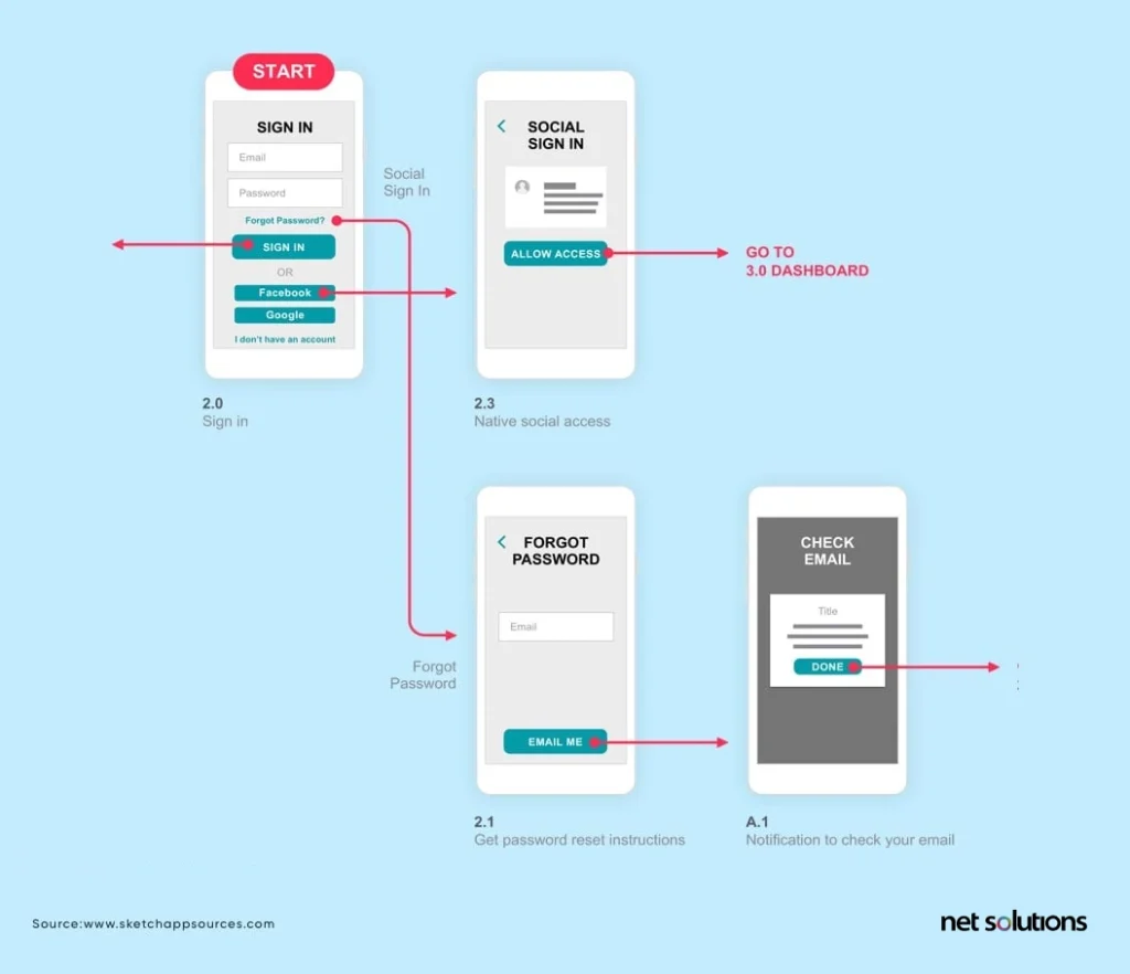
Prototyping is an experience design process of creating interactive simulations or sketches that work or look like the final product, and getting these validated with broader teams of users, including end-users, stakeholders, developers, and designers.
And, doing all this quickly is called rapid prototyping. In recent years, rapid prototyping has been adopted by design and development teams and has been one of the unavoidable UX stages.
“If a picture is worth 1,000 words, a prototype is worth 1,000 meetings.”– Tom & David Kelley
Prototyping is a vital part of the UX design life cycle for two key reasons:
- Visualization — Prototypes help UX designers show stakeholders how the final product would look and function.
- Feedback — Prototypes create input from test groups of users. Potential users can interact with the final product and feature areas that are difficult to understand. The design team would then be able to repeat the design before rolling out the final product, saving the company time and money.
A typical rapid prototyping process involves the following three steps:
a. Creating the Prototype
In the first step, prototypes are created based on the product’s description given by stakeholders and data gathered from user research.
b. Reviewing the Prototype
Meeting user’s needs is one of the major UX design principles. So, after building a prototype, all product stakeholders must review and analyze it. Its evaluation should be based on whether it meets the end user’s requirements or not.
c. Refining the Prototype
Once the feedback is received, the prototype is refined as per the changes suggested by users. It is an iterative process, and you need to keep improving until the prototype meets the requirements of the final visualized product.
However, before getting into rapid prototyping, it’s essential to scope a prototype, while keeping the following things in your mind:
Decide what needs to be prototyped. Mainly, complex applications are the right ones for creating a prototype. Determine what percentage of the final product needs to be prototyped. In this case, focus only on those features that will be used the highest number of times.
Weave a story around the prototype so that it covers all features developed in the prototype. It’s about creating a user journey that should evaluate all features included.Plan your iterations, so that broader areas are prototyped first, such as creating a homepage or critical landing pages first. As you move along several iterations, focus on detailed aspects of prototyping, such as users trying to find a brochure or downloading it.
Determine how closely the prototype will resemble the final product. For example, will it be a sketched prototype or a styled prototype? Will it be static or interactive? Will it include dummy text or real content?
8. Testing
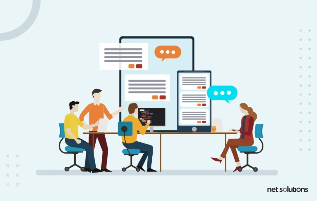
Testing is the last of the user experience steps that involves evaluating and benchmarking the usability of a final product with real users. Testing is the key to delivering delightful user experiences to end-users. Depending on a particular project, testing may involve the following approaches:
a. Usability Testing
Usability testing consists of evaluating and benchmarking the usability of a final product with real users. It is the key to delivering delightful user experiences to end-users. All or a combination of the following techniques can be used to conduct usability testing:
- Concurrent Think Aloud (CTA) testing involves real-time feedback and user responses as they interact with a product.
- Retrospective Think Aloud (RTA) technique asks users to retrace steps they followed to complete a task.
- It helps in determining whether a particular process is repeatable.
- Concurrent Probing (CP) involves asking questions from users while a testing session is in progress.
- Retrospective Probing (RP) is about asking questions and thoughts of users after they’ve completed their session.
b. Site Analytics
It is particularly relevant in scenarios when you already have a website up and running. Site analytics provide valuable data related to various metrics like click-path, average time spent on the website, bounce rate, etc., that gives useful insights about user behavior.
Based on the analytics data, you can then enhance the IA, navigation, and other UX elements, implement the changes, and revisit the analytics data to see if the changes resulted in any improvement.
c. A/B Testing
A/B testing is a method to test two variations of a web page by subjecting them to experimentation and finding the version that delivers better results.
For example, there are two website designs, and you want to know which works better. To find this out, split the traffic to these two website versions and measure their performance based on metrics such as the number of conversions, bounce rate, sales, etc.
How can you successfully implement UX Design?
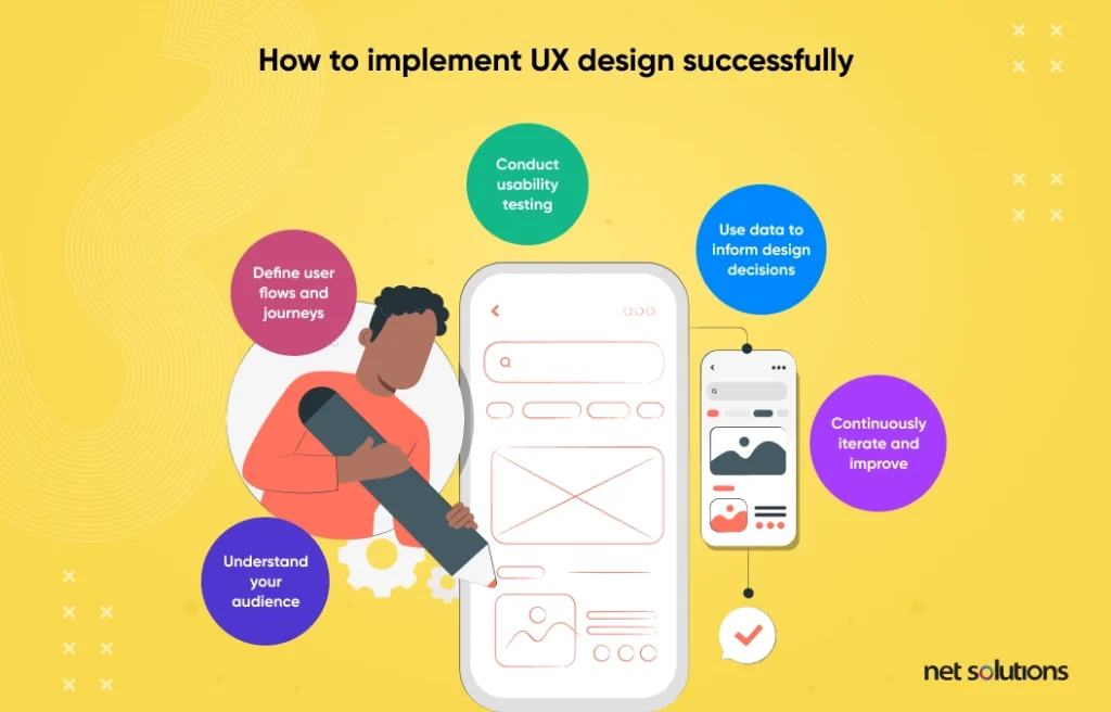
The step-by-step UX design process and methodology don’t simply offer customers an intuitive and pleasurable experience — it allows designers to emphasize and improve their designs.
The initial step to designing an interface your users will adore is knowing precisely what that process involves. To give an insight into the ideal approach, this blog briefly explains the eight UX design steps. You can use these steps as your UX process checklist to craft seamless product experiences.
The user experience design process starts with understanding the business goals and how to serve the target audience best. Comprehending user psychology and applying the UX design steps to your next project can help create compelling and memorable user experiences.
However, below are a few steps to achieve UX Improvement that can push you in the right direction.
1. Understand your audience:
The first step in UX improvement is understanding your target audience and their needs and goals. This includes gathering user feedback, conducting user research, and analyzing user data to identify areas of improvement.
2. Define user flows and journeys:
Once you clearly understand your audience, you can define the key user flows and journeys that need to be optimized. This involves mapping out the steps users take to complete specific tasks or achieve specific goals and identifying any pain points or areas of friction.
3. Conduct usability testing:
Usability testing is essential to UX improvement. This involves testing your product or service with real users to identify areas of improvement, gather feedback, and validate design and functionality decisions.
4. Use data to inform design decisions:
User data is an invaluable resource in UX improvement. This includes website analytics, user research, and A/B testing results, among other sources. By analyzing this data, you can identify areas of improvement and make informed design decisions that enhance the user experience.
5. Continuously iterate and improve:
UX improvement is an ongoing process that requires continuous iteration and improvement. This means regularly gathering user feedback, testing new designs and features, and making changes based on the data and insights gathered.
Frequently Asked Questions
Both Azure and AWS have their strengths and weaknesses. Choosing between them depends on your specific needs and requirements. Here are the factors you must consider while comparing Azure and AWS:
- Align buyer personas to reader personas.
- Make sure the journey makes sense from every angle.
- Have a productive brainstorm.
- Make wireframing effortless with a flawless inventory list.
- Ensure all UI elements are authentic and accessible.
- Find and fix any red routes.
UX research techniques let you learn more about your users’ behavior, needs, and motivations. You can use various user research techniques, including user interviews, surveys, focus groups, card sorting, usability testing, and more, to pinpoint problems and opportunities to enhance the user experience.
- Usability
- Visual Hierarchy
- Accessibility
- Usability
- Consistency
- Context
- User control
- Familiarity
Discover, Define, Design, Develop, Deploy, and Drive.

